Why Has T-Series Never Changed Its Logo? A Design Perspective
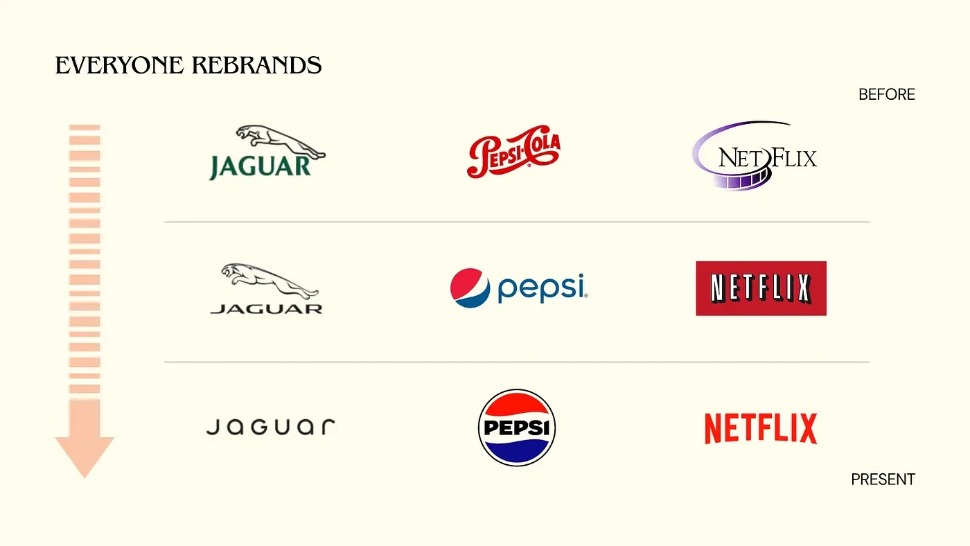
You remember when Jaguar rebranded last year, right? The design world exploded. Everyone had a take — some loved it, some hated it, but one thing was clear: we noticed. It became a case study overnight. And it wasn’t just Jaguar. From Netflix to Airbnb, even NASA — brands evolve, redesign, adapt.
But then, there’s T-Series.
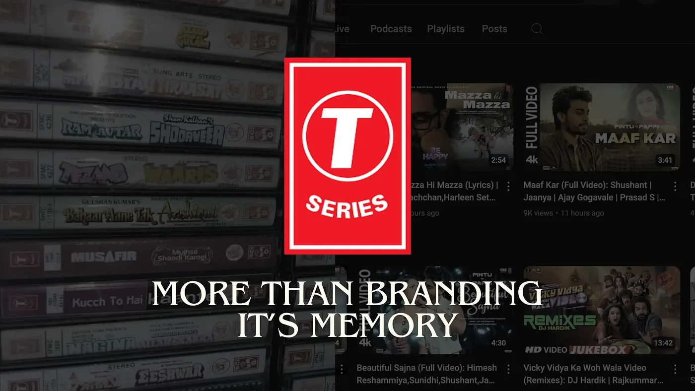
Now, this is a bit different. T-Series hasn’t updated its logo once since the 1980s. Some tweaks as per the medium used on but the design? Never touched. The same logo. And no one’s really talking about it.
So, why is that? Well, I think it’s more than branding — it’s memory.
Why Hasn’t T-Series Changed Its Logo?
Think about it — T-Series built its empire long before Instagram grids, logo breakdowns, or influencer culture took over. Generations have grown up with this logo. From parents who bought cassettes in the 90s to Gen Z streaming Bollywood bangers or devotional tracks on YouTube, that logo has been there every step of the way.
It’s not just a logo; it’s a cultural anchor. The familiar red badge with the bold ‘T’ has become iconic in its own right. Over time, it’s stopped being about visual perfection and started being about recognition.

And when you already have one of the most loyal, massive, and culturally connected audiences in the world, why would you risk breaking that connection? The logo isn’t just a mark; it’s a part of the brand’s legacy.
Plus, T-Series is everywhere. On posters, thumbnails, film credits, audio tracks — you see it enough times, and your brain starts linking it with trust, volume, and legacy. It signals consistency in an industry that changes fast.
The Case for Rebranding
But here’s the interesting part — this conversation opens up a much deeper discussion around the role of logos in brand identity.
A logo isn’t just a symbol. It’s a shortcut to memory. A promise. A familiar face in a sea of noise.
For many brands, evolving a logo is a way to signal growth, adapt to cultural shifts, or stay relevant in changing times. That’s why we’ve seen even the most iconic names — Jaguar, Burger King, BBC, and Instagram — update their logos. Not to break from their past, but to better represent who they are now.
So when should a company rebrand?
When the audience is shifting
New markets, new generations, new values? A refreshed logo can help bridge that gap. Think of how Netflix evolved as it transitioned from DVDs to streaming.When the visual doesn’t match the vision
Sometimes a company outgrows its original identity. It could have started as a scrappy startup, but now it’s a global powerhouse. A redesign might be necessary to reflect that.When it’s time to declutter
Legacy elements can be beautiful, but sometimes they also weigh things down. Modern logos often trend toward simplicity, not to erase history but to make it more accessible. Look at Pepsi — same essence, modernized approach.
When NOT to Rebrand
Now, let’s flip this around. When should a company not rebrand?
When the logo has become inseparable from the brand’s emotional core
Like T-Series, Coca-Cola, or even Chanel. These logos aren’t just representations of a brand; they are the brand.When change could confuse or alienate loyal users
If your audience is built on legacy and trust, shaking things up too much can do more harm than good.When the original identity still works
Maybe it’s not trendy or Instagrammable, but if the original logo still connects with your core audience, why fix something that’s not broken?
The Takeaway: Is Rebranding Always Necessary?
Rebranding isn’t just a design decision — it’s a strategic move. It’s about timing, audience, vision, and cultural context. T-Series may never redesign its logo, and honestly, that might be the most on-brand move it can make.
But for a lot of brands — especially startups, creators, and digital-first companies — the lesson here is this:
Your logo isn’t just sitting pretty. It’s carrying meaning, memory, and momentum.
So here’s the real question: Does it still carry the right ones?
T-Series might never need to change. But as a designer, I can’t help but feel there’s room for some refinement. The logo is iconic, sure, but it’s not perfect.
In the next blog, I’ll dive into the specifics — how I would approach refining the T-Series logo for better balance, legacy, and modern design language.
Stay tuned. 👀
#TSeries #LogoDesign #BrandEvolution #DesignThinking #LogoRefinement #Branding