When UX Whispers, We Listen: What Amazon’s Mother’s Day Reminder Teaches Us About Emotional Design
The Power of a Small Shift
A tiny change in how Amazon displays delivery information — swapping “Arrives by May 5” with “Arrives before Mother’s Day”, might seem trivial at first glance. But in the world of design, this subtle switch reveals a deep understanding of human behavior. This isn’t just good UX, it’s emotional design in action.
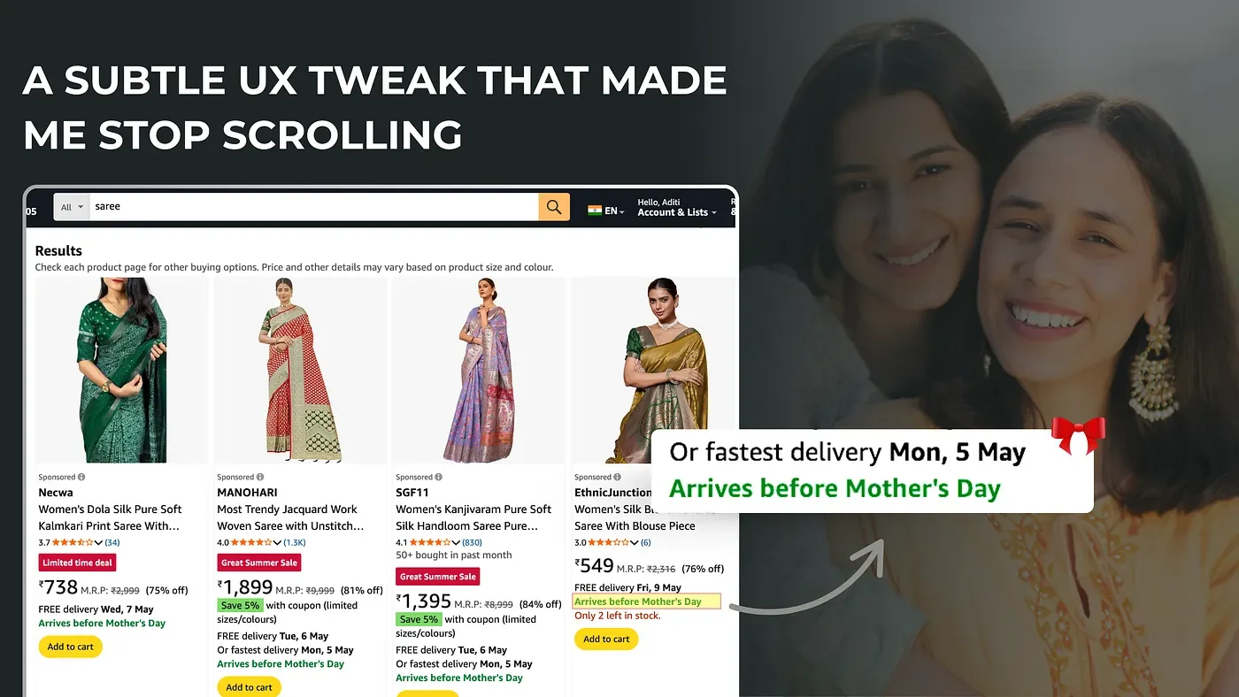
Searched on 3rd May 2025 @amazon.in
Framing Emotion, Not Just Information
In psychology, this is known as temporal framing. Presenting the same date in a contextually emotional way (“Mother’s Day”) instead of a neutral one (“May 5”) creates a personal connection. It’s no longer about logistics. It’s about making sure someone’s mother feels loved, on time.
This taps into the salience bias, our brain prioritizes information that’s emotionally or socially relevant. “May 5” is a number. “Mother’s Day” is a feeling. Amazon isn’t just showing delivery speed. It’s showing they understand what matters to you.
What This Reveals About Emotional Design
This tiny tweak is a textbook case of emotional design- where utility meets empathy.
Functional UX: Shows when a product will arrive.
Emotional UX: Shows why that timing matters.
It’s about helping users make meaningful decisions by aligning the interface with emotional priorities. The shift doesn’t require flashy visuals or animations. It’s rooted in language. And yet, it drastically changes how a user feels about their purchase.
The Psychological Science Behind It
Temporal Framing influences how urgent or meaningful an action feels. A deadline feels different when emotionally framed (“Submit before Diwali”) vs neutrally framed (“Submit by June 14”).
Salience Bias ensures we’re more likely to pay attention and act on information that feels socially or personally urgent.
Micro-motivation: People delay purchases often due to decision fatigue or detachment. By anchoring a purchase in an emotional occasion, Amazon gently nudges the user forward.
What Designers Can Learn
This design choice teaches us a few key lessons:
Microcopy is macro-power- One word can shift perception.
Context > Content- Facts are helpful. Framed facts are powerful.
Emotion creates urgency without anxiety- Unlike countdown timers or aggressive “Only 3 Left!” banners, this approach doesn’t create panic. It creates care.
Amazon’s small shift in delivery messaging isn’t just a UX improvement- it’s a signal. It says, “We understand you’re not just buying a product. You’re planning a feeling.” Emotional design doesn’t have to be big or loud. Sometimes, it just needs to be right.