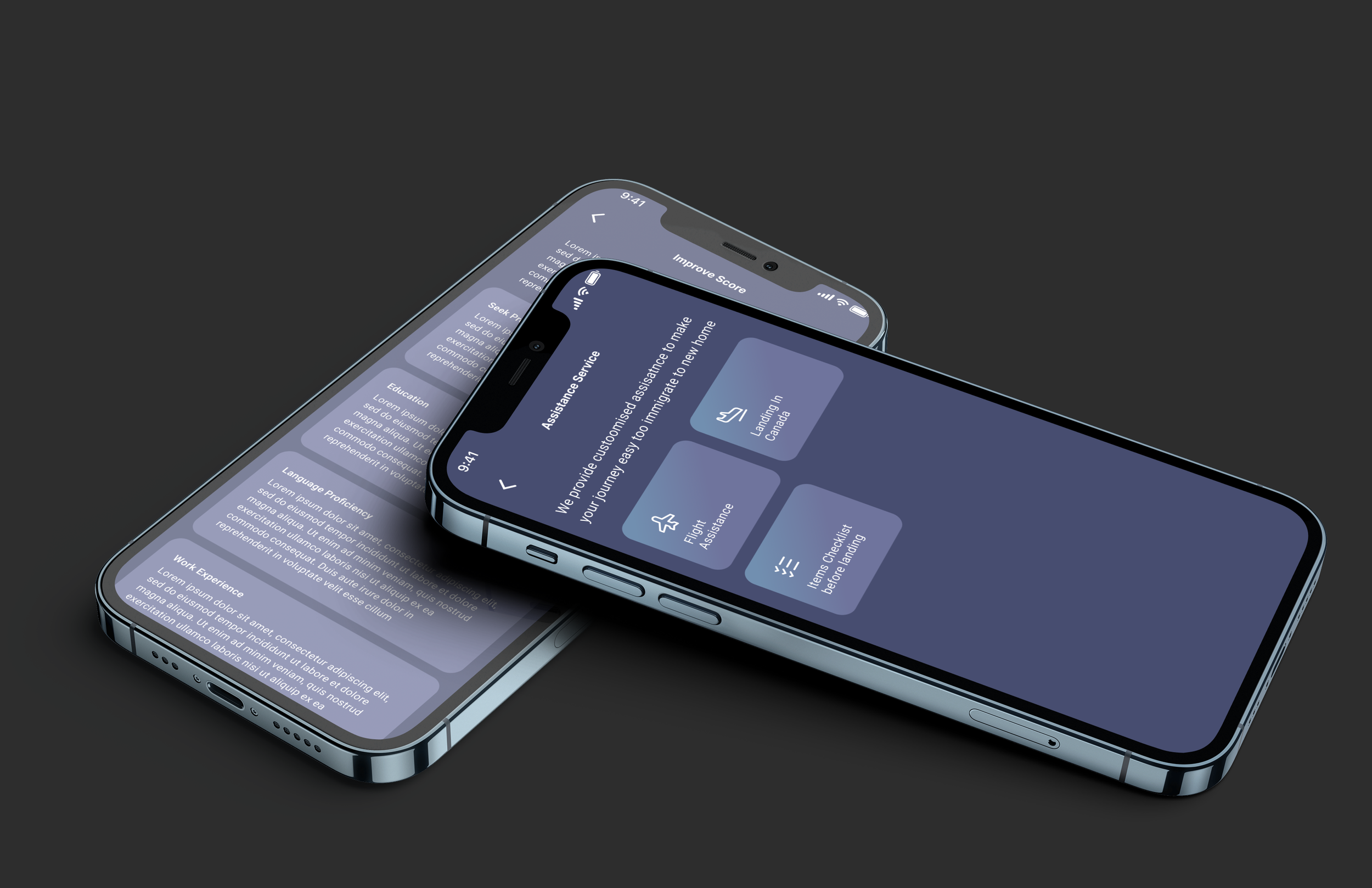
Immigration App
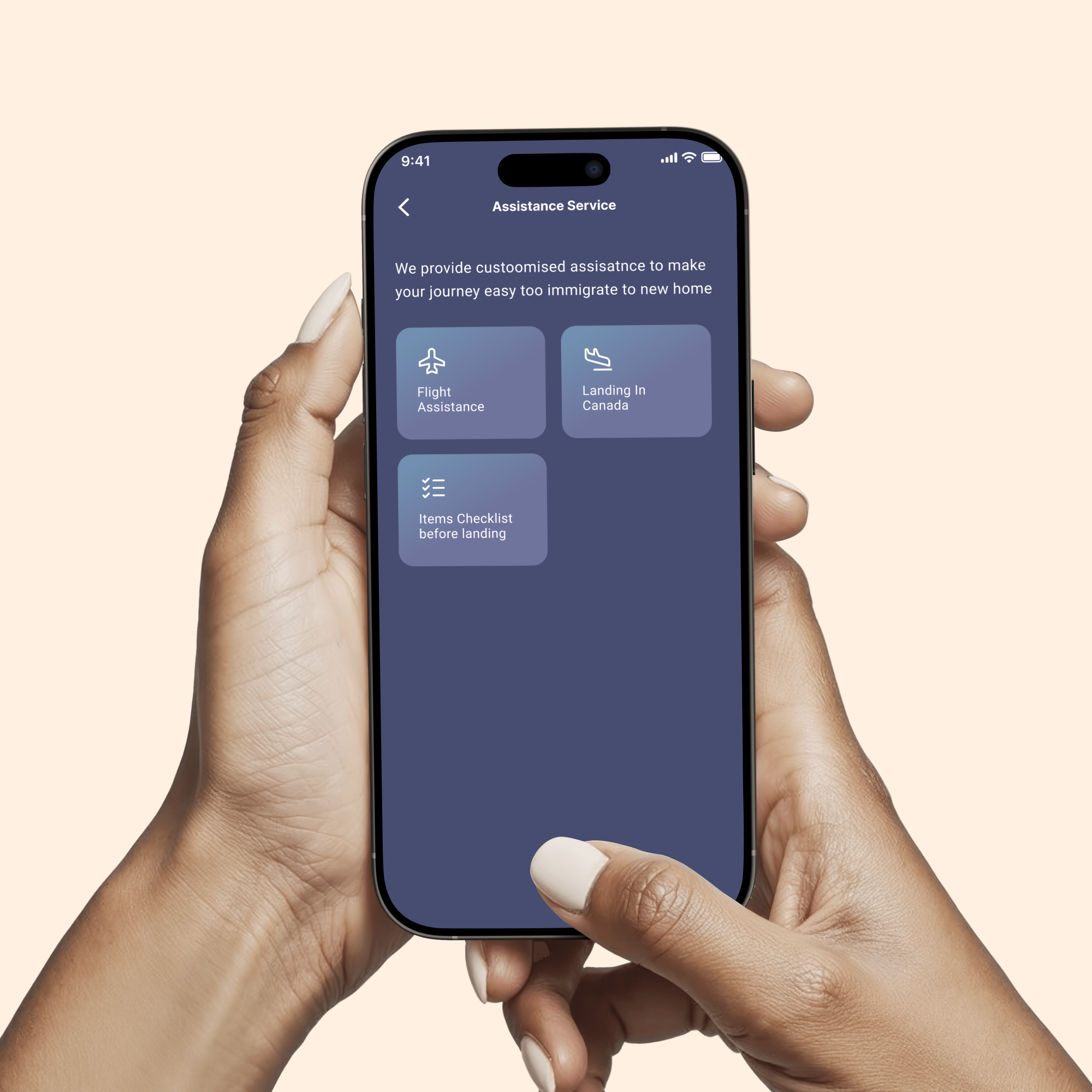
A mobile app designed to simplify immigration tracking by turning complex scores and draw data into clear, easy-to-understand insights, helping users feel informed, confident, and guided throughout their immigration journey.
Branding
Website Design
Customised Illustrations
A simple app that helps users track immigration scores and plan next steps clearly.
Client / Industry: Immigration Services / Public Information Systems
Services: UX Research, UX Strategy, UI/UX Design
Platform: Mobile App
Duration: 6 weeks
Immigration data is complex and stressful for users. Scores, ranks, and draw history are hard to understand, especially for first-time applicants. Existing platforms show numbers but fail to explain what they mean or what users should do next. This confusion leads to anxiety, poor decision-making, and low confidence in the immigration process.
The Problem
The goal was to design a simple, clear app that helps users understand their immigration score, track past draws, and confidently plan their next steps without feeling overwhelmed.
The Goal
Our Approach
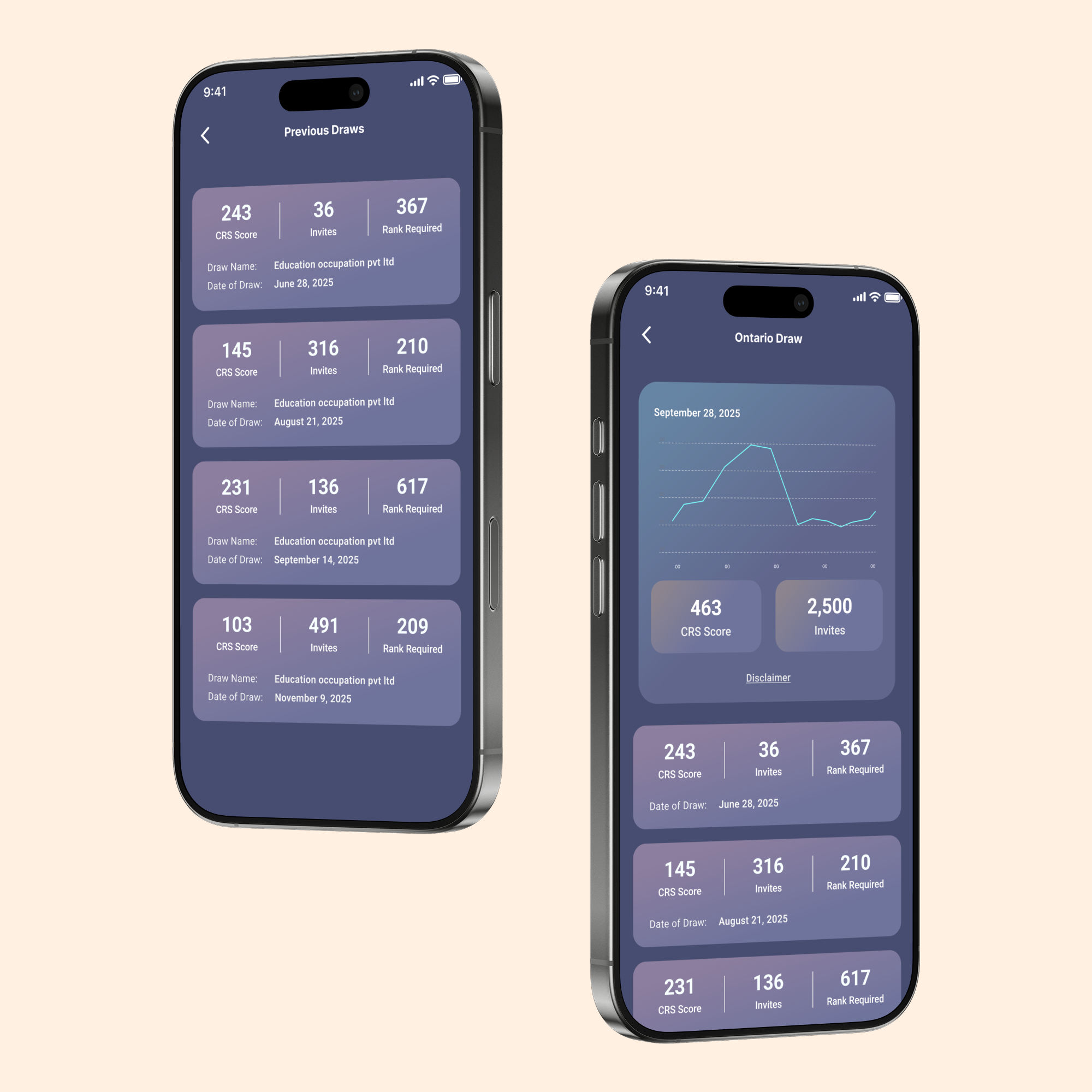
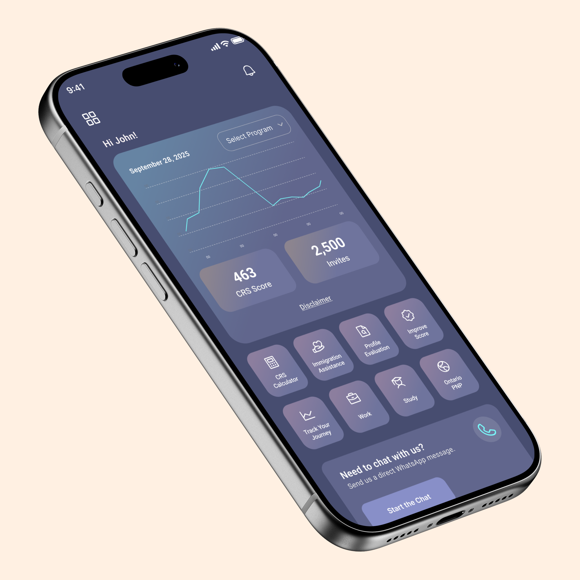
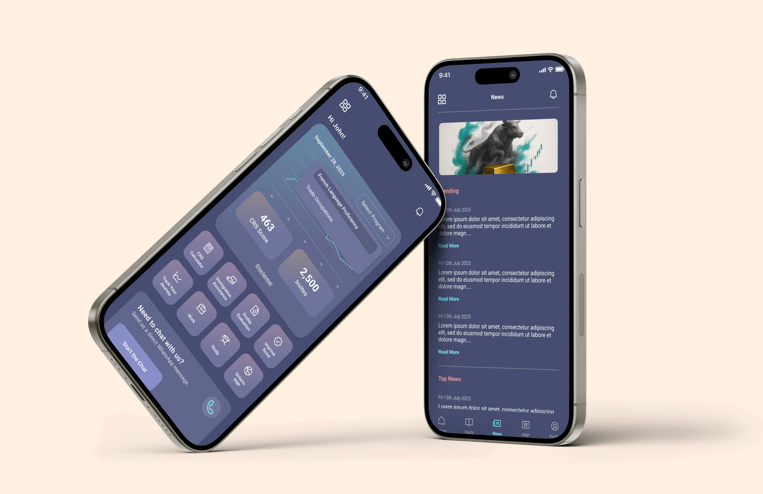
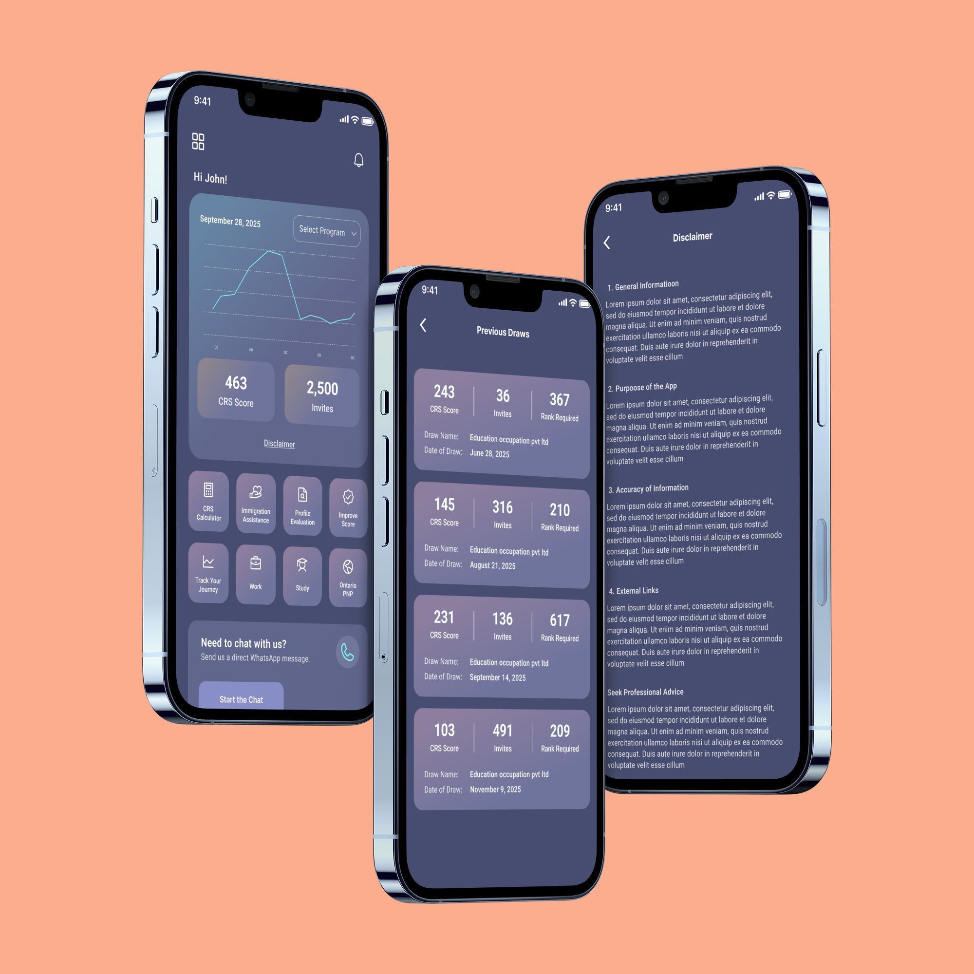
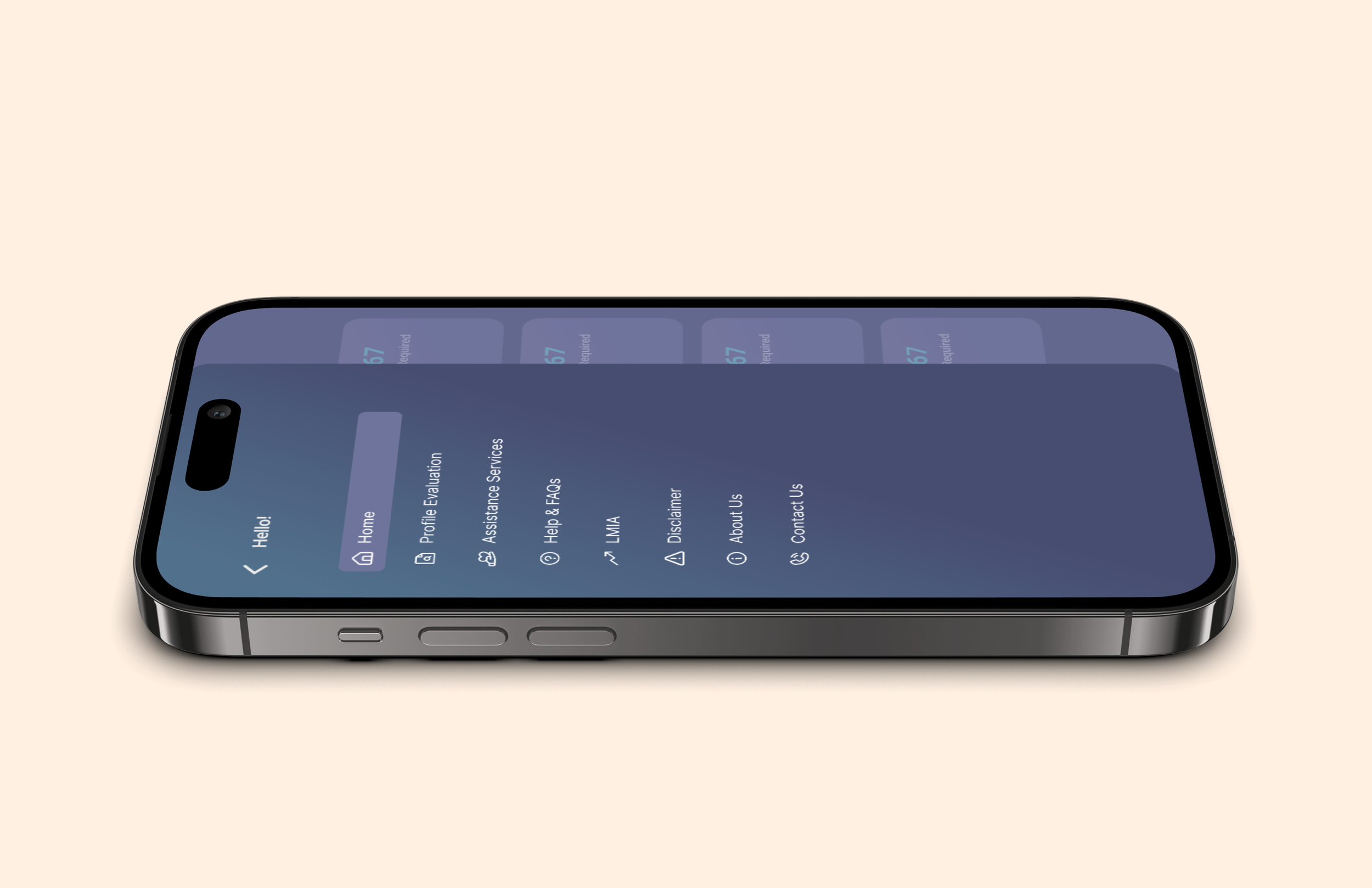
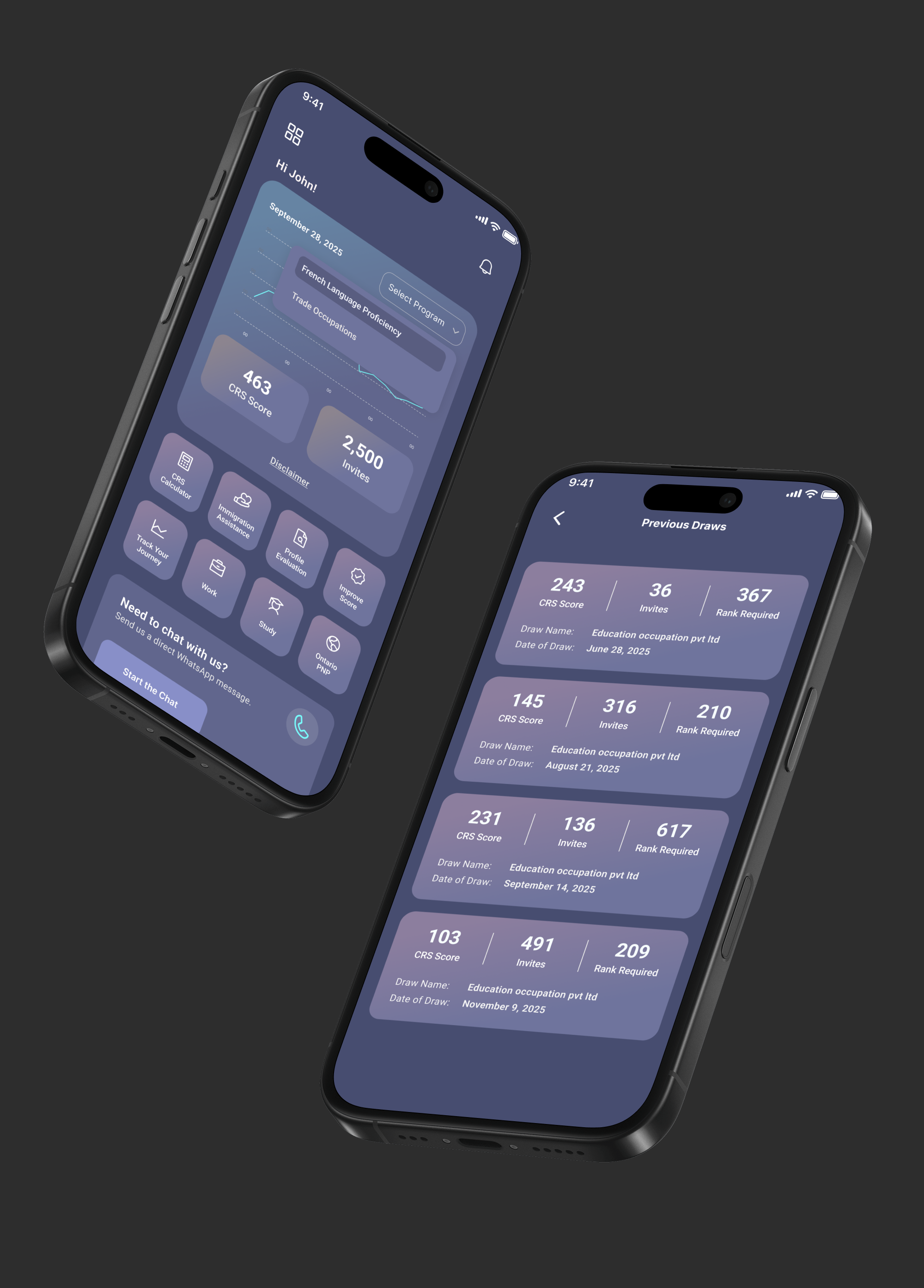
We began by understanding common user confusion around immigration scores and draw data. The experience was planned around clarity, not complexity. Information was grouped into clear sections like score overview, past draws, and improvement tools. Visual graphs were used instead of heavy tables. The interface was kept calm and minimal to reduce stress. Designs were validated by checking readability, ease of navigation, and how quickly users could find answers.
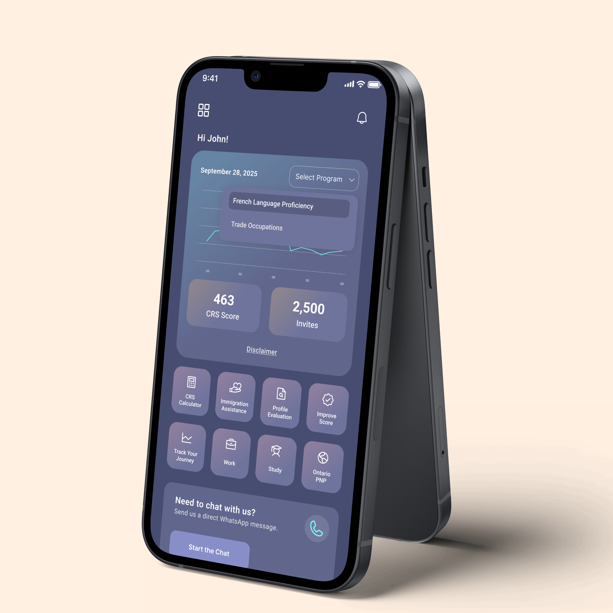
Used a dashboard-first layout so users see key information instantly
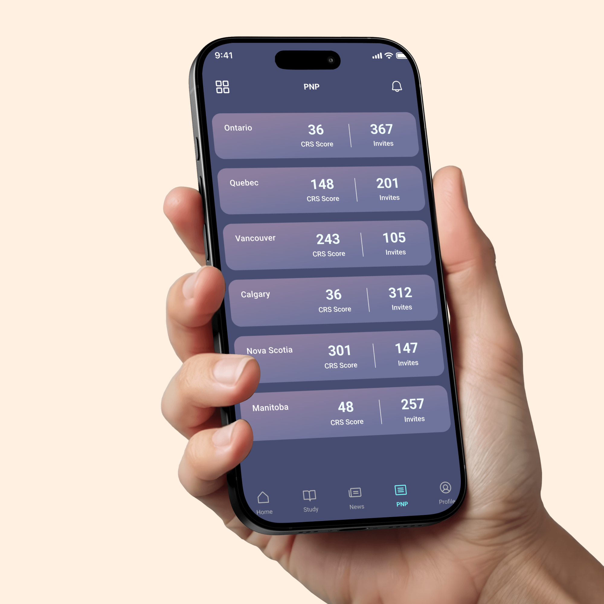
Designed card-based content to simplify complex data
Highlighted important numbers using large, readable typography
Added visual graphs to show trends instead of raw data
Included quick tools and chat support to guide users beyond numbers
Key Design Decision
Outcome
The final design delivers a calm, easy-to-use immigration tracking app. Users can quickly understand their score, review past draws, and access helpful tools without confusion. The system feels supportive rather than overwhelming and is scalable for future features and programs.
What This Project Shows
This project highlights Pixel & People’s strength in simplifying complex systems, designing calm experiences, and creating human-centered digital products grounded in clarity and trust.

