Hospital Navigation System
A multi-platform healthcare system designed to support patients and hospital staff. The project covers wellness comparison, medical test booking, hospital way-finding, and admin dashboards, built with strong UX logic and clear, calm UI.
Mobile App
Hospital System
UI/UX Design
A full healthcare system designed to simplify patient journeys and hospital operations.
Client / Industry: Healthcare / Hospital Systems
Services: UX Research, UX Strategy, UI/UX Design
Platform: Web / Mobile / Multi-platform
Duration: 6 weeks
The Problem
The existing healthcare experience was fragmented. Users struggled to compare wellness data, book medical tests, and navigate inside hospitals. Information was scattered across platforms, increasing confusion and delays. For hospital staff, admin dashboards lacked clarity, making daily operations slow and error-prone. The system needed a unified, easy-to-use design that could support both patients and internal teams without adding complexity.
The goal was to design one connected healthcare system that improves clarity, reduces friction, supports patients through critical tasks, and enables hospital staff to manage operations efficiently across multiple platforms.
The Goal
Our Approach
We followed a research-led and system-first design approach.
First, we studied user behavior, hospital workflows, and common pain points. Next, we mapped the full experience across wellness checks, test booking, way-finding, and admin controls. We then defined clear user flows and information hierarchy for each role. The UI was designed with healthcare-safe visuals, accessibility in mind, and reusable components to ensure consistency across platforms. Each design decision focused on reducing cognitive load and building trust.
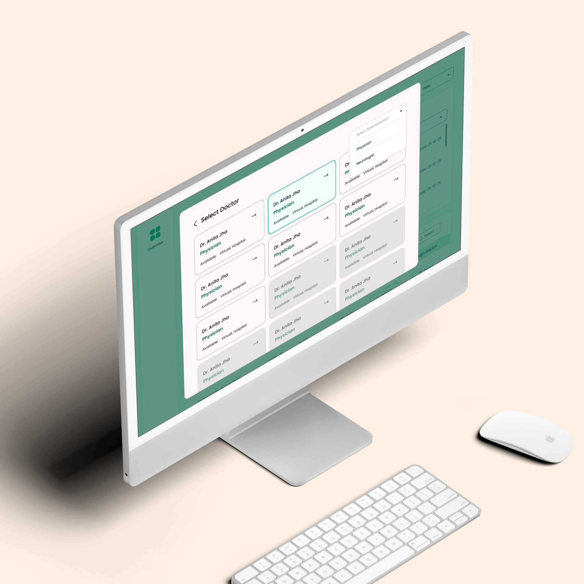
Structured information to support different user roles without overlap
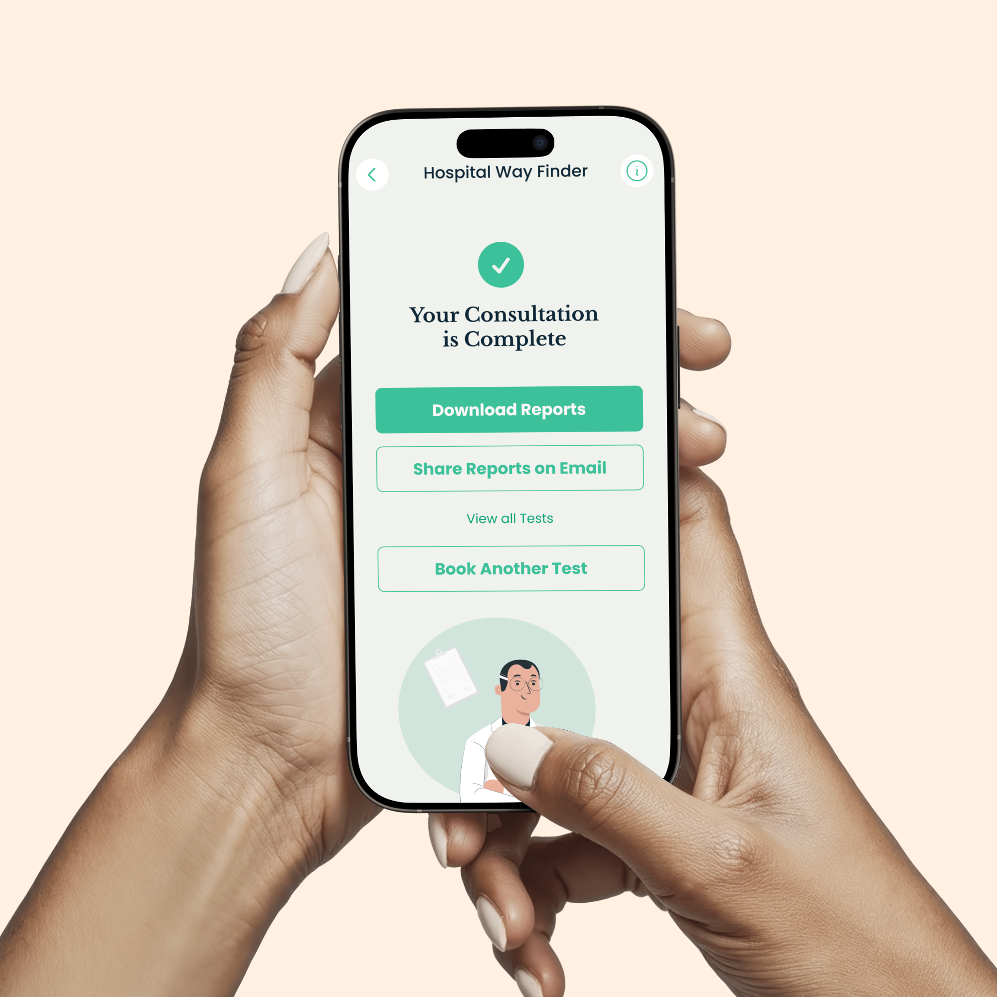
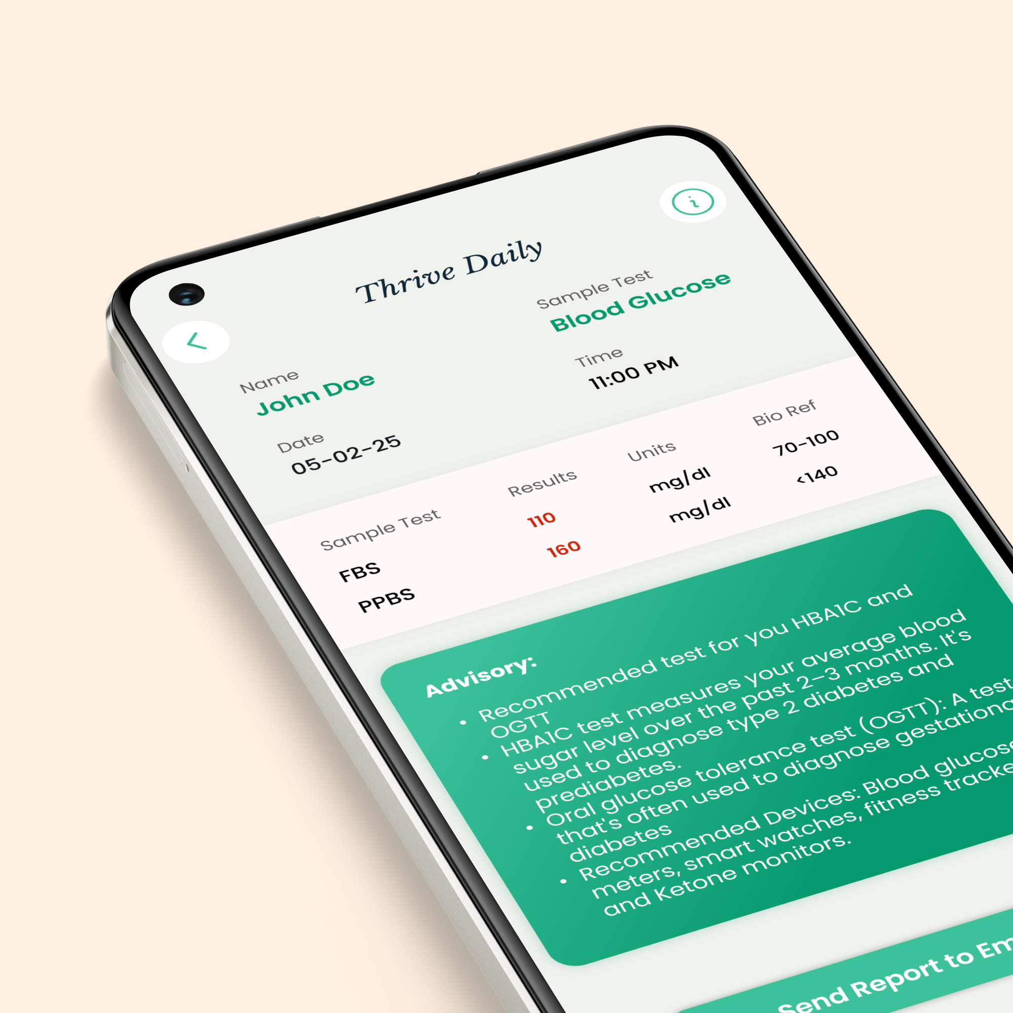
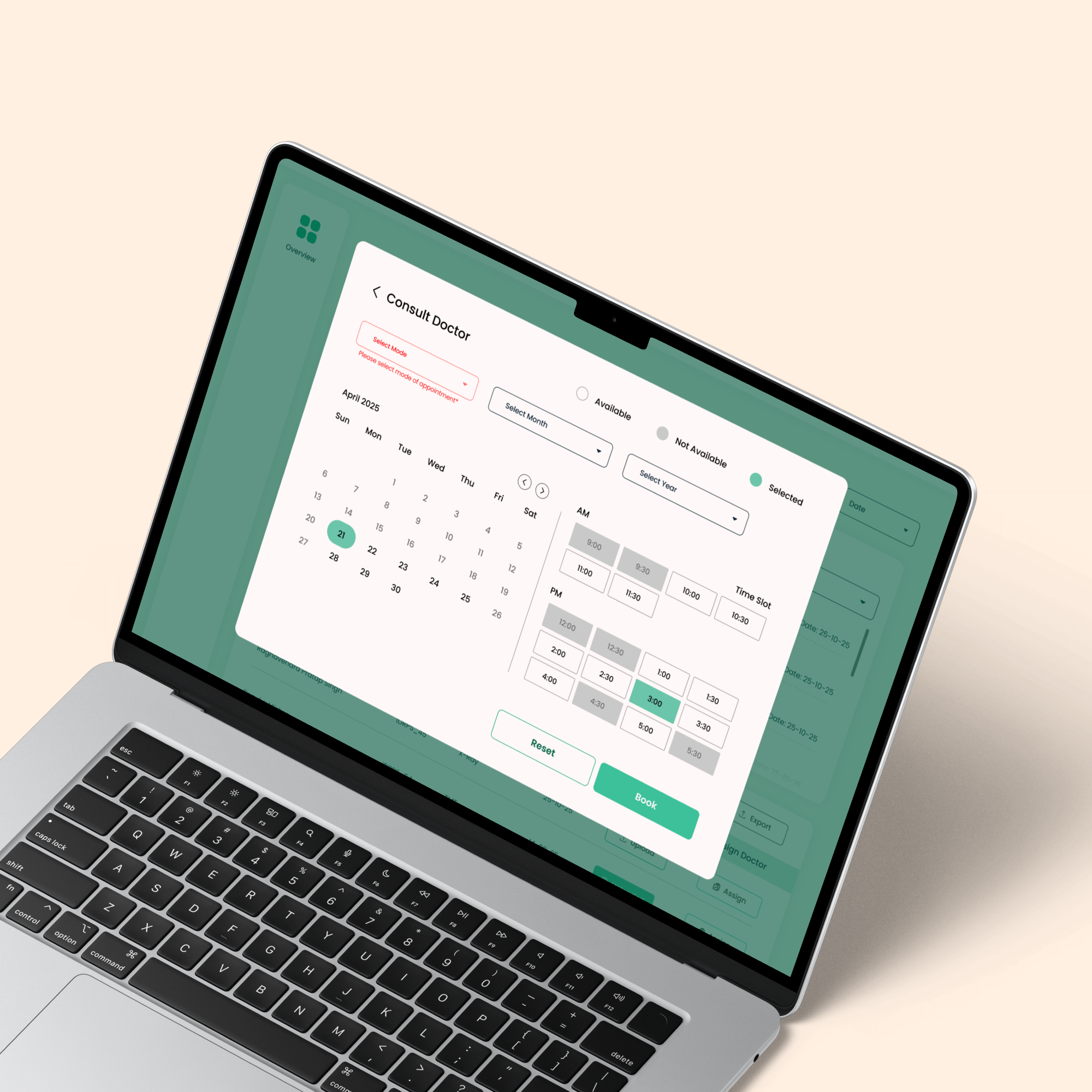
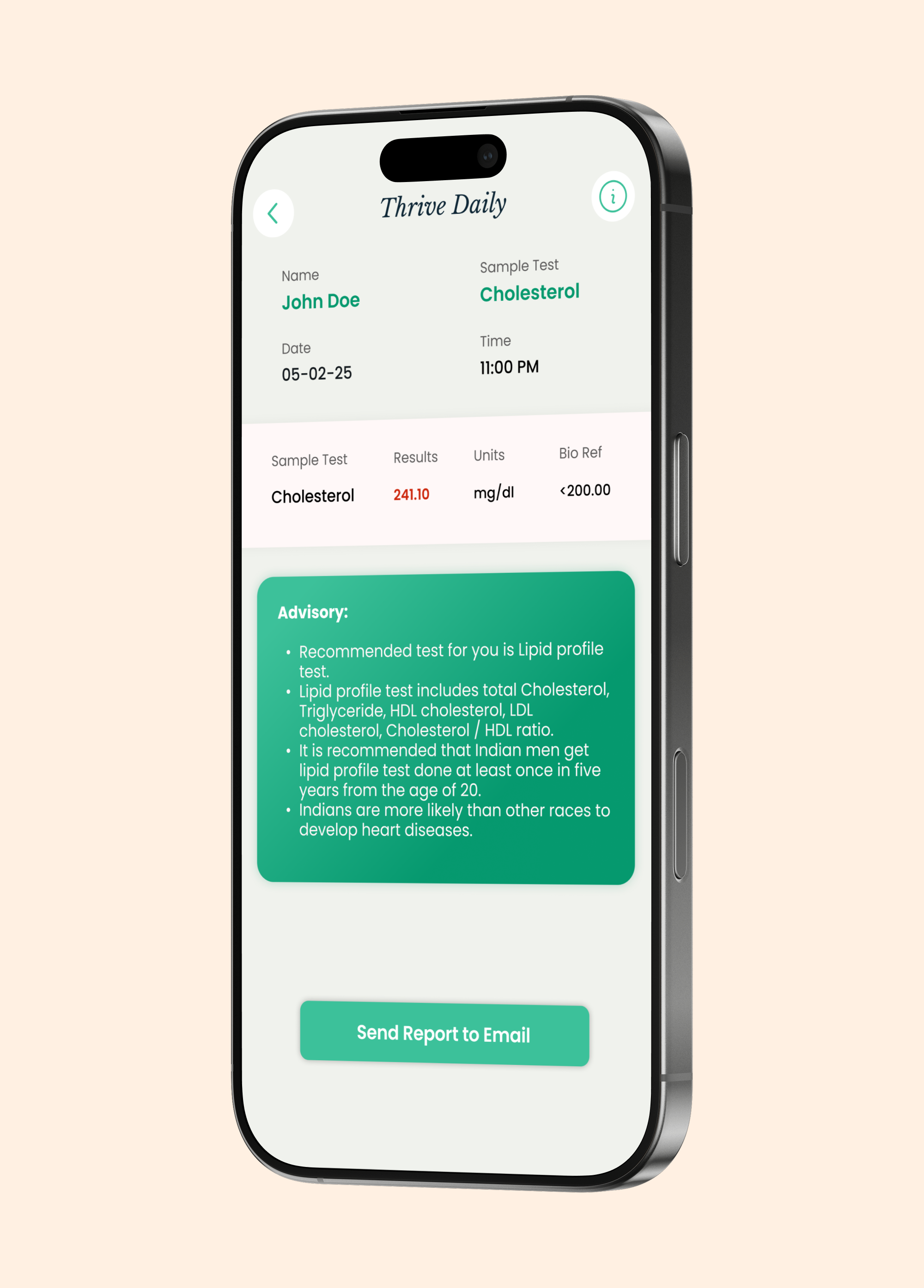
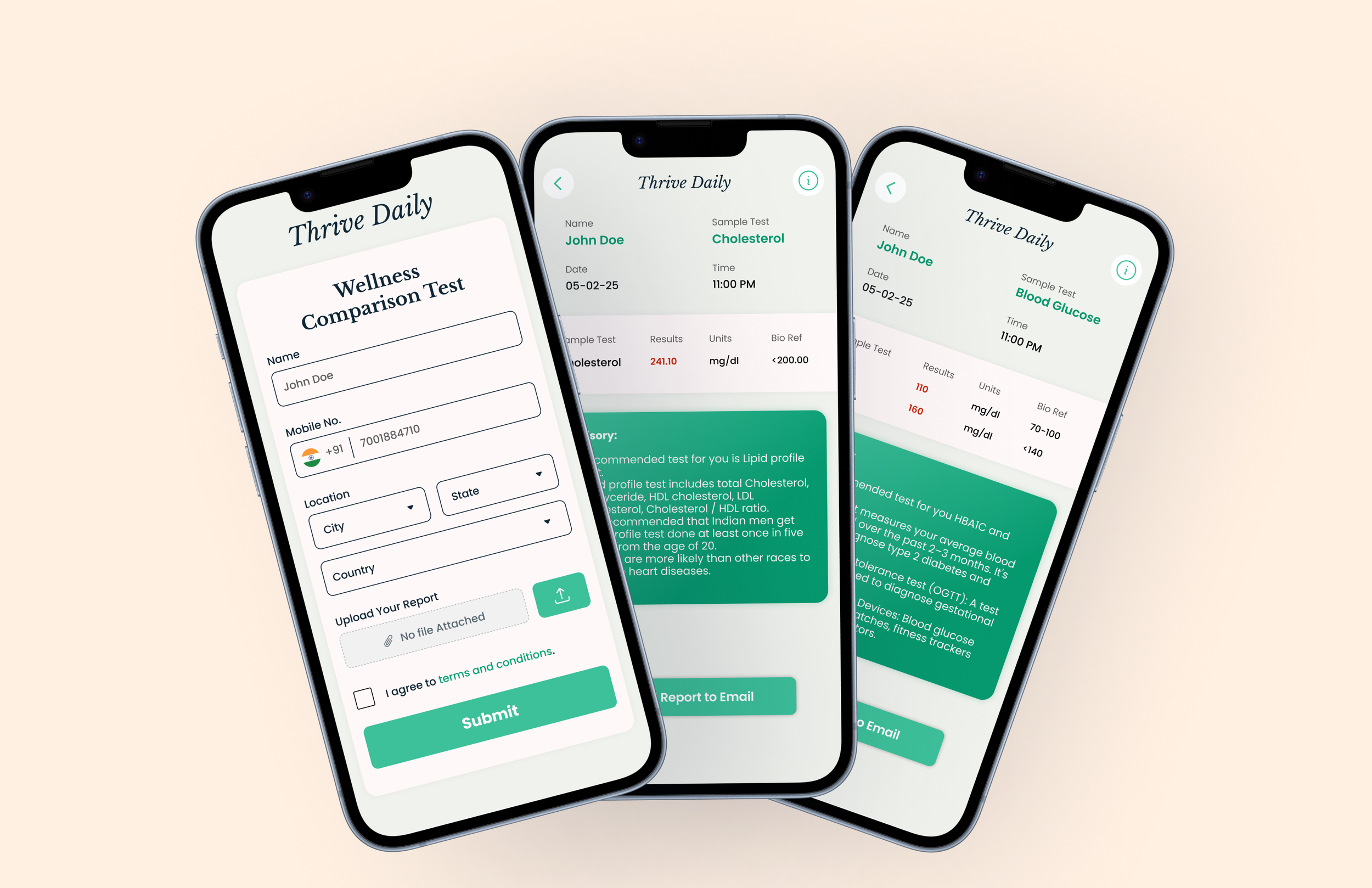
Designed clean, step-by-step booking flows to reduce errors
Used high-contrast visuals and large touch targets for hospital environments
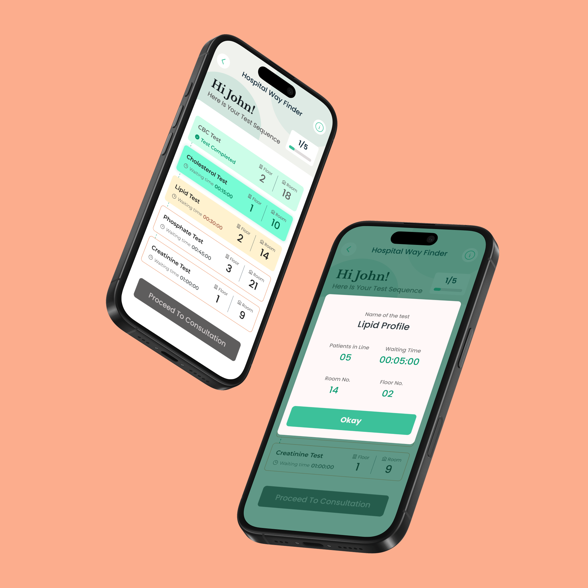
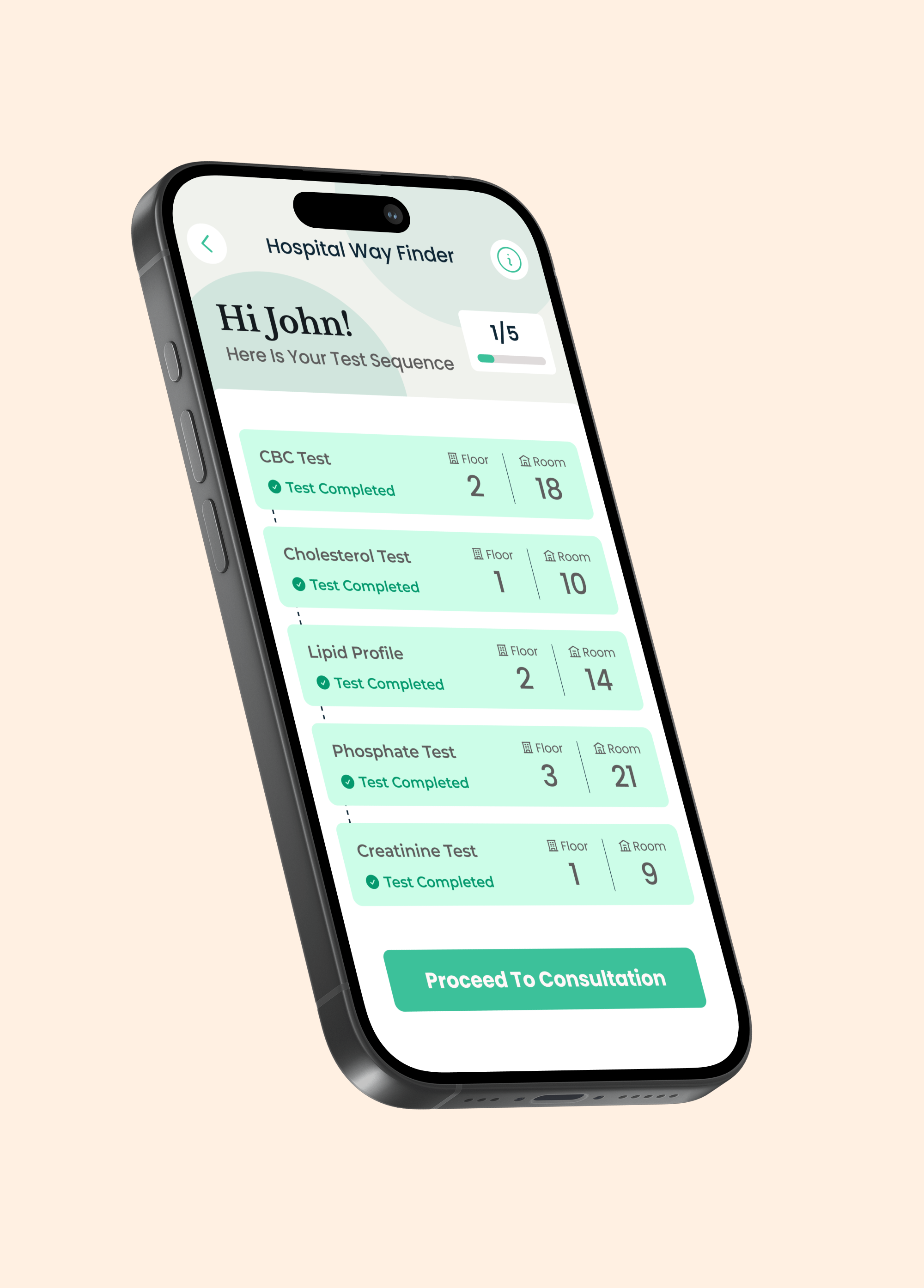
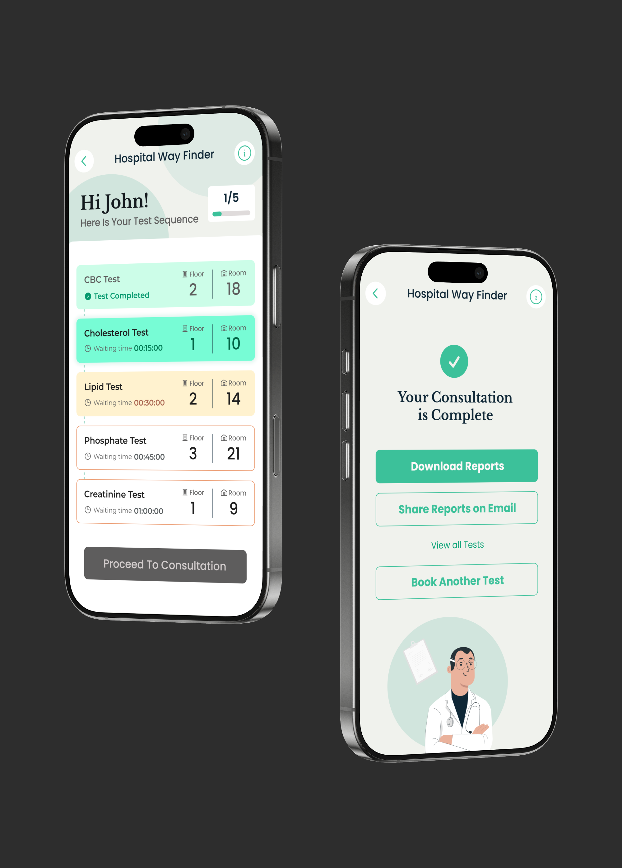
Built a simple way-finding system with clear directions and visual cues
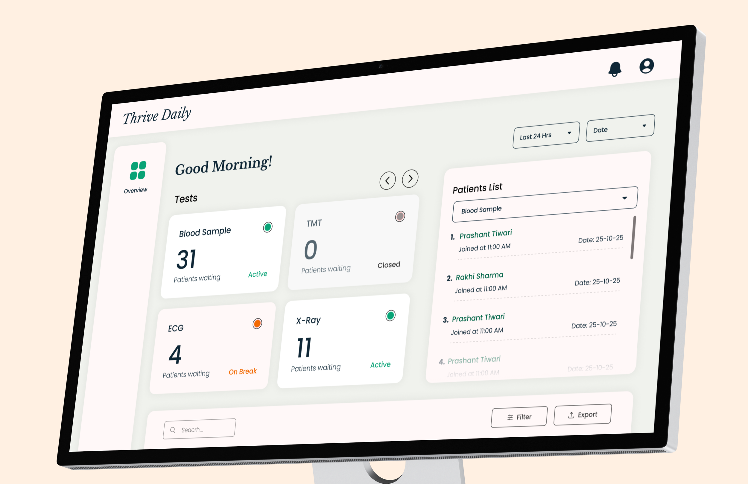
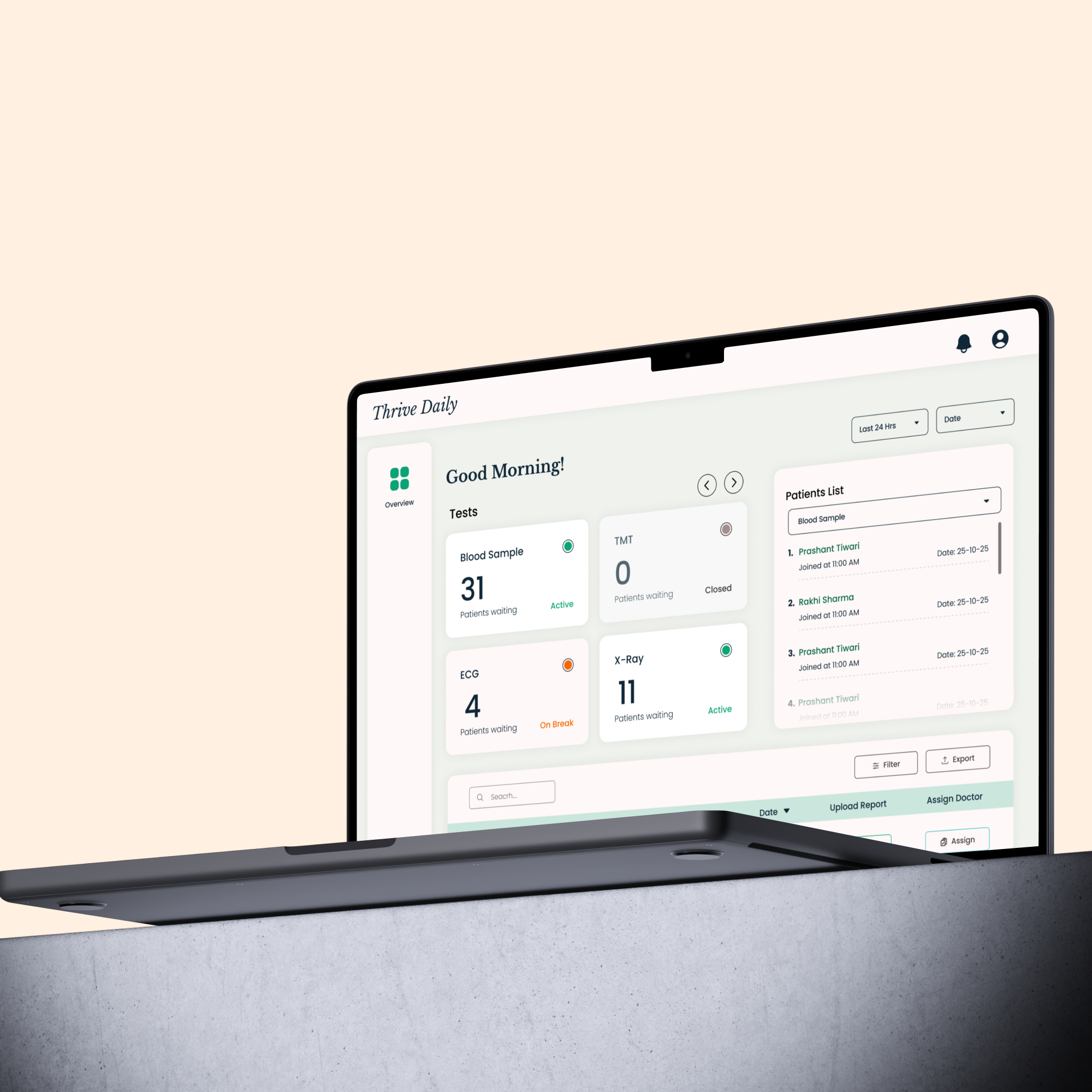
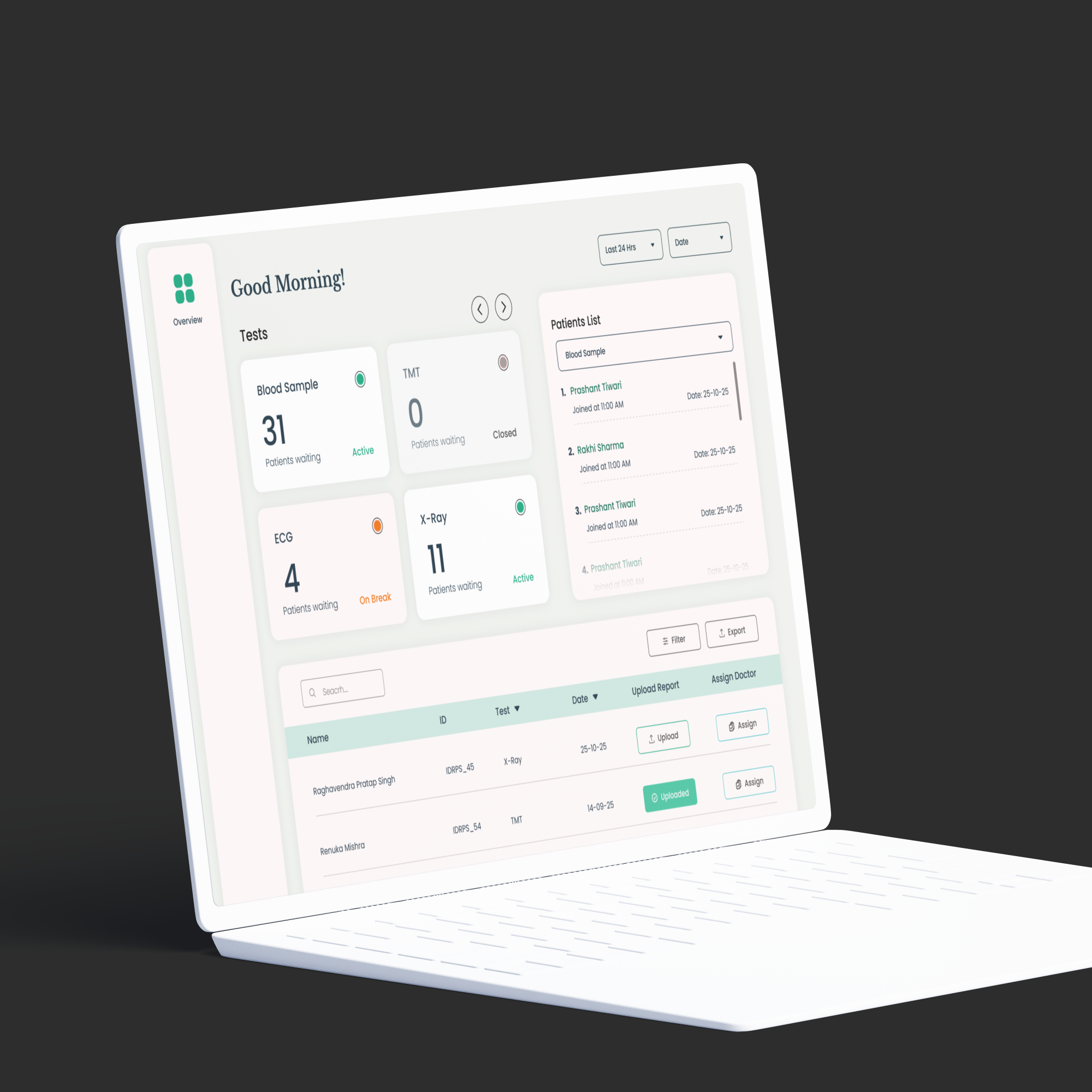
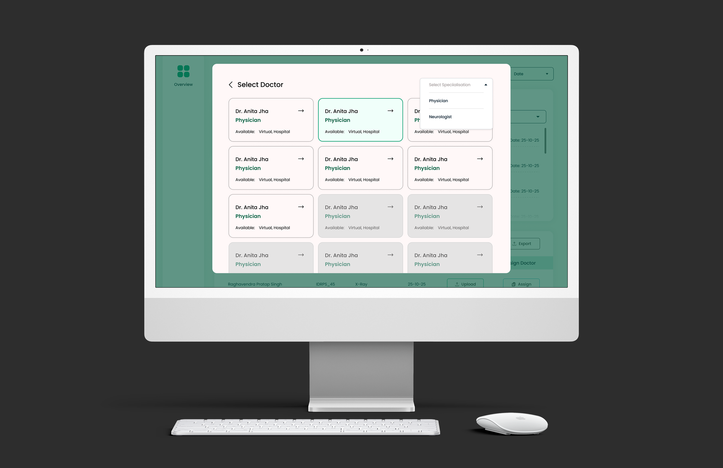
Created scalable admin dashboards with clear data blocks and alerts
Key Design Decision
Outcome
The final system delivers a calm and connected healthcare experience. Users can compare wellness data, book tests quickly, and navigate hospitals with ease. Staff can manage operations through clear and efficient dashboards. The system is scalable, consistent, and designed for real-world healthcare use.
What This Project Shows
This project highlights Pixel & People’s expertise in designing complex healthcare systems through research-led UX, scalable UI frameworks, and deep understanding of real hospital workflows.