Hear Good
It is a hearing aid mobile app to make sound amplification simple and usable for senior citizens and people with hearing difficulties, focusing on clarity, accessibility, and stress-free everyday use.
UX Design
UX Strategy
Mobile App Design
Redesigning a hearing app to improve clarity, ease of use, and daily comfort.
Client / Industry: Healthcare / Assistive Technology
Services: UX Research, UX Strategy, UI/UX Design
Platform: Mobile (Android)
Duration: 4 weeks
The existing hearing aid app was difficult to use for senior citizens and people with hearing impairment. The interface was cluttered, controls were small, and important actions were hard to find. Users struggled with understanding sound settings, switching modes, and using the app quickly in real-life situations. This caused frustration and reduced trust in the app, even though the core sound amplification feature was useful.
The Problem
The goal was to redesign the app to make hearing support simple, safe, and accessible. The focus was on reducing confusion, improving clarity, and enabling users to hear better with minimal effort and learning.
The Goal
Our Approach
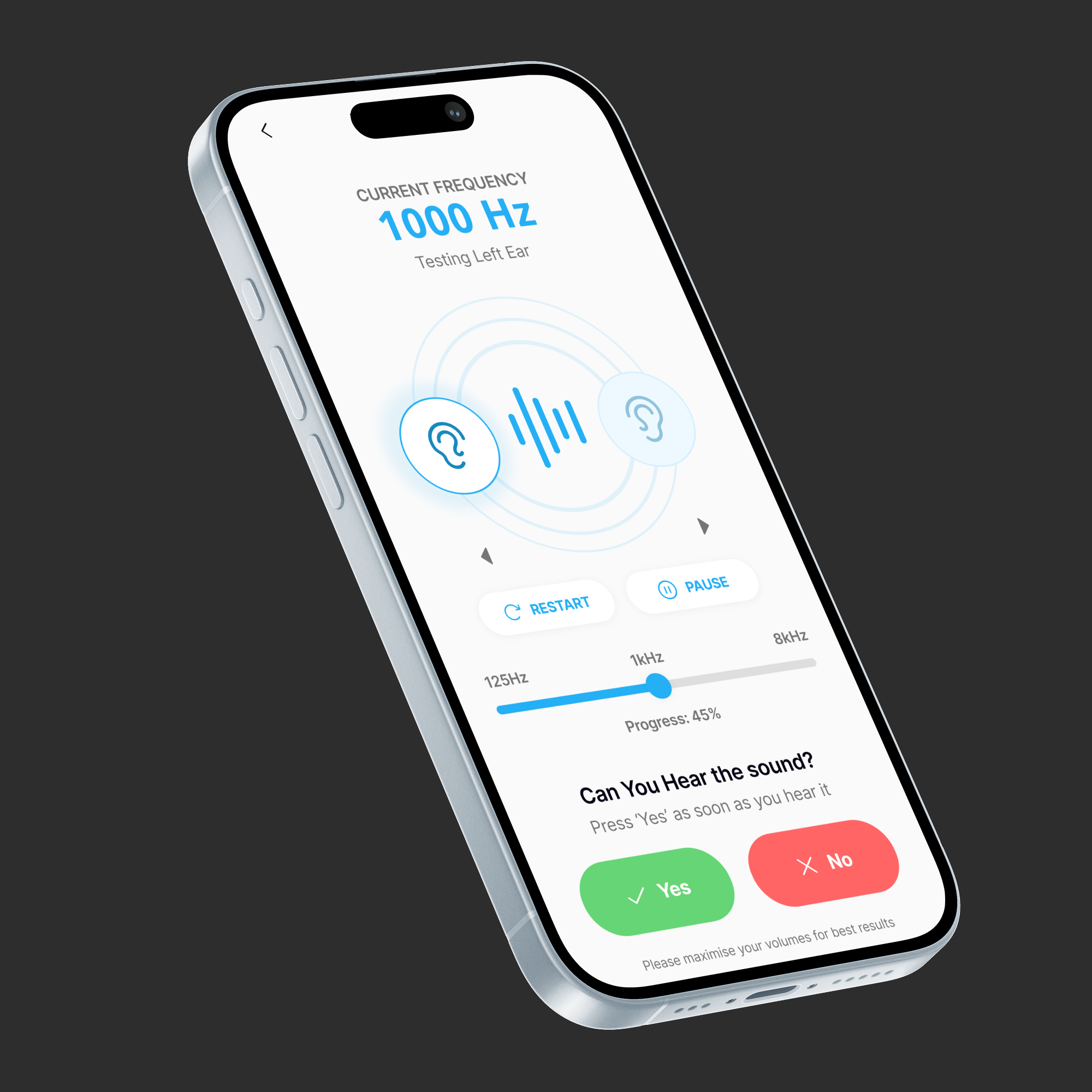
We started by analysing existing hearing aid apps and understanding common user pain points, especially for senior users. We mapped real-life use cases such as home conversations, outdoor noise, TV listening, and meetings. Based on this, we simplified the user flow and reduced cognitive load. The design focused on clear hierarchy, large controls, and preset-based usage. Accessibility, safe volume limits, and easy onboarding were treated as core design requirements, not add-ons.
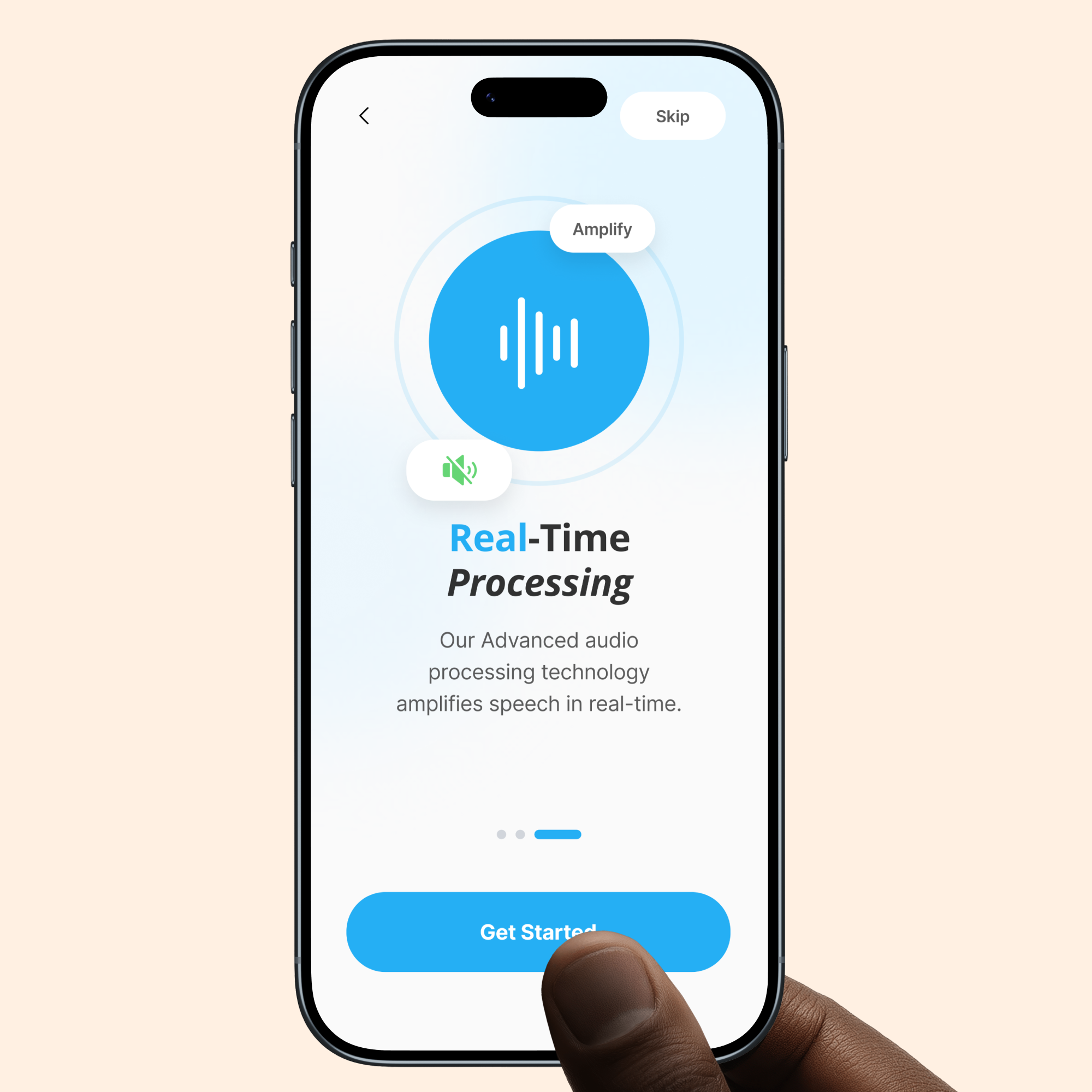
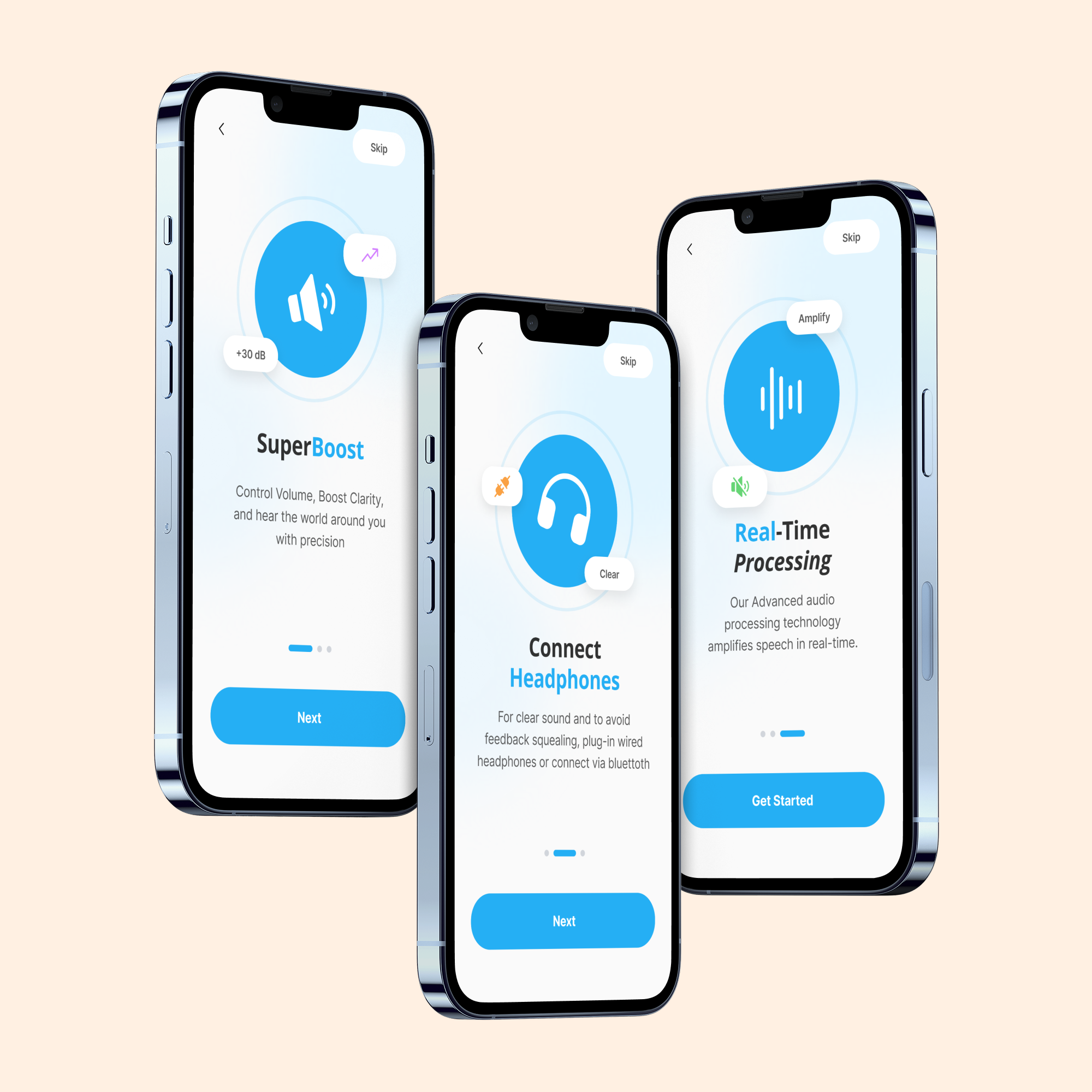
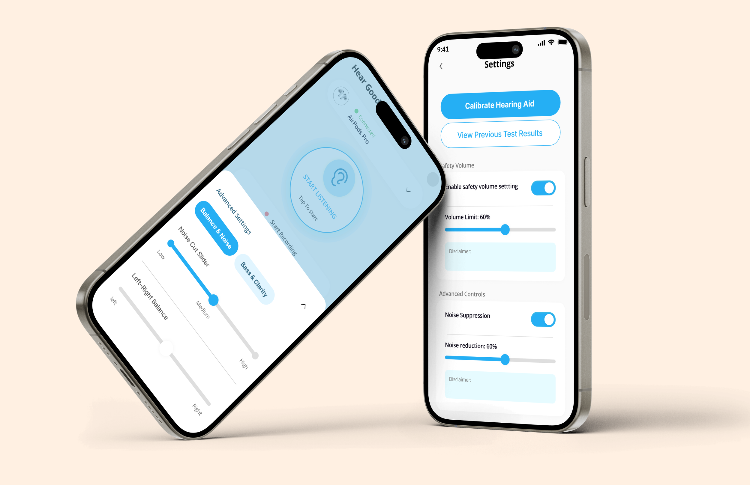
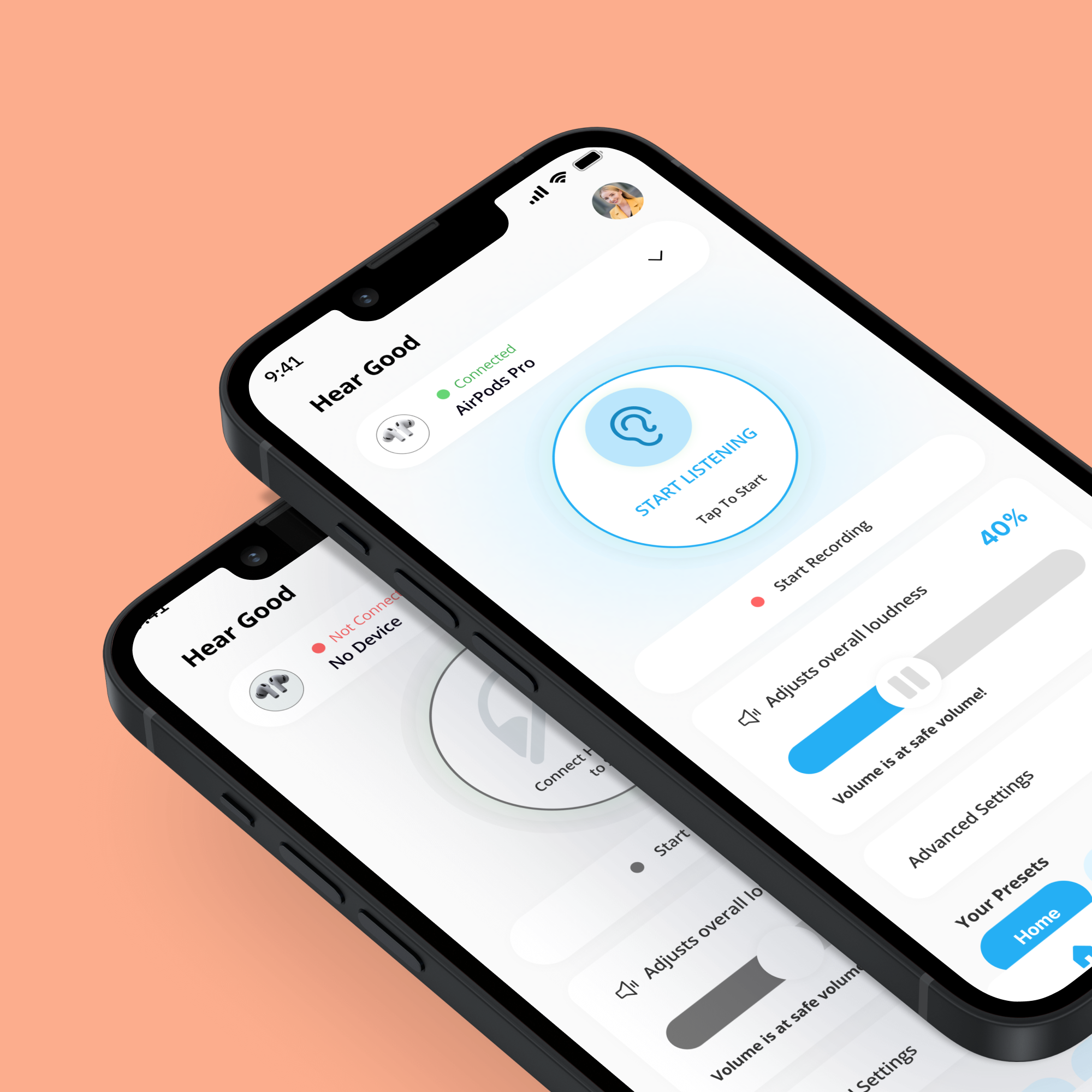
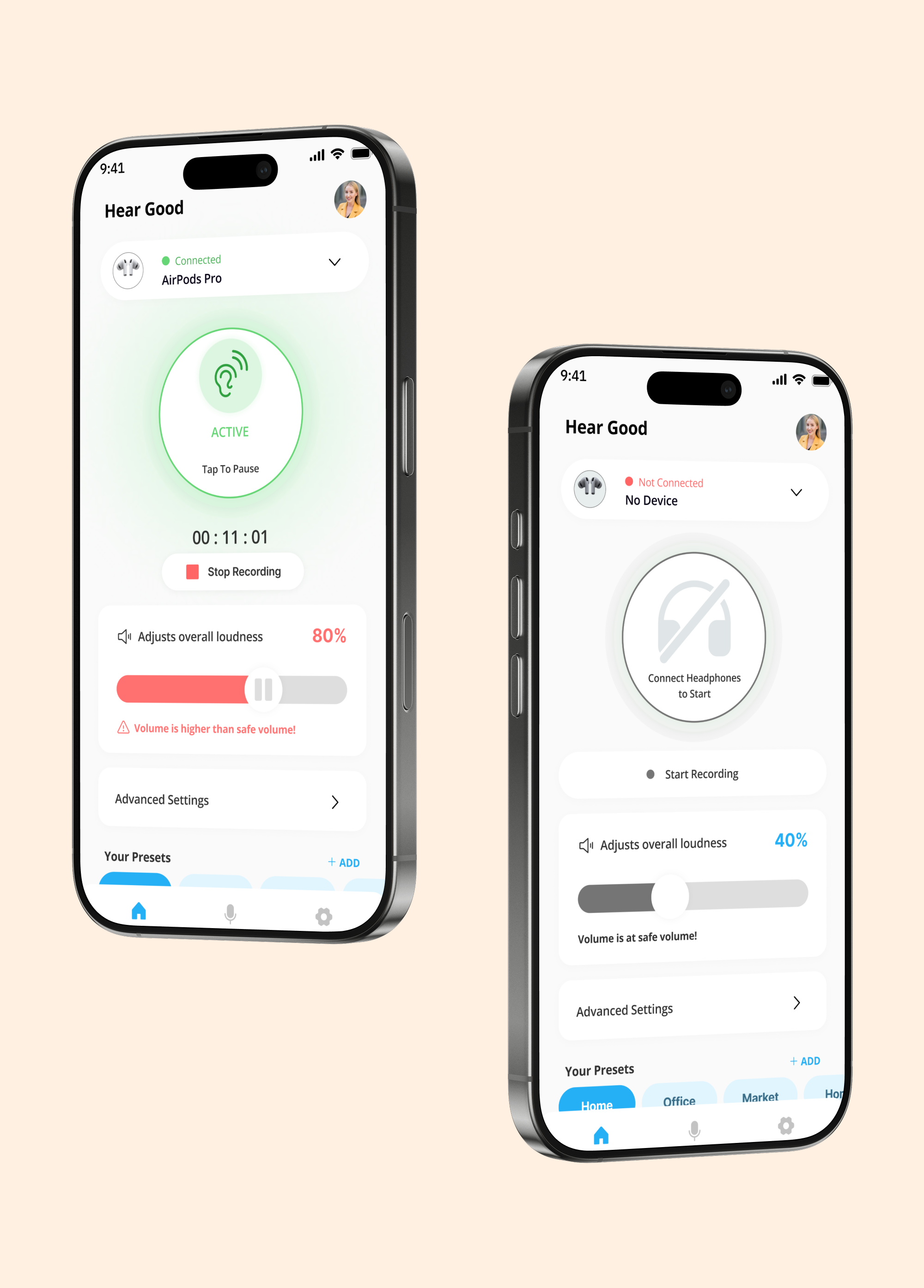
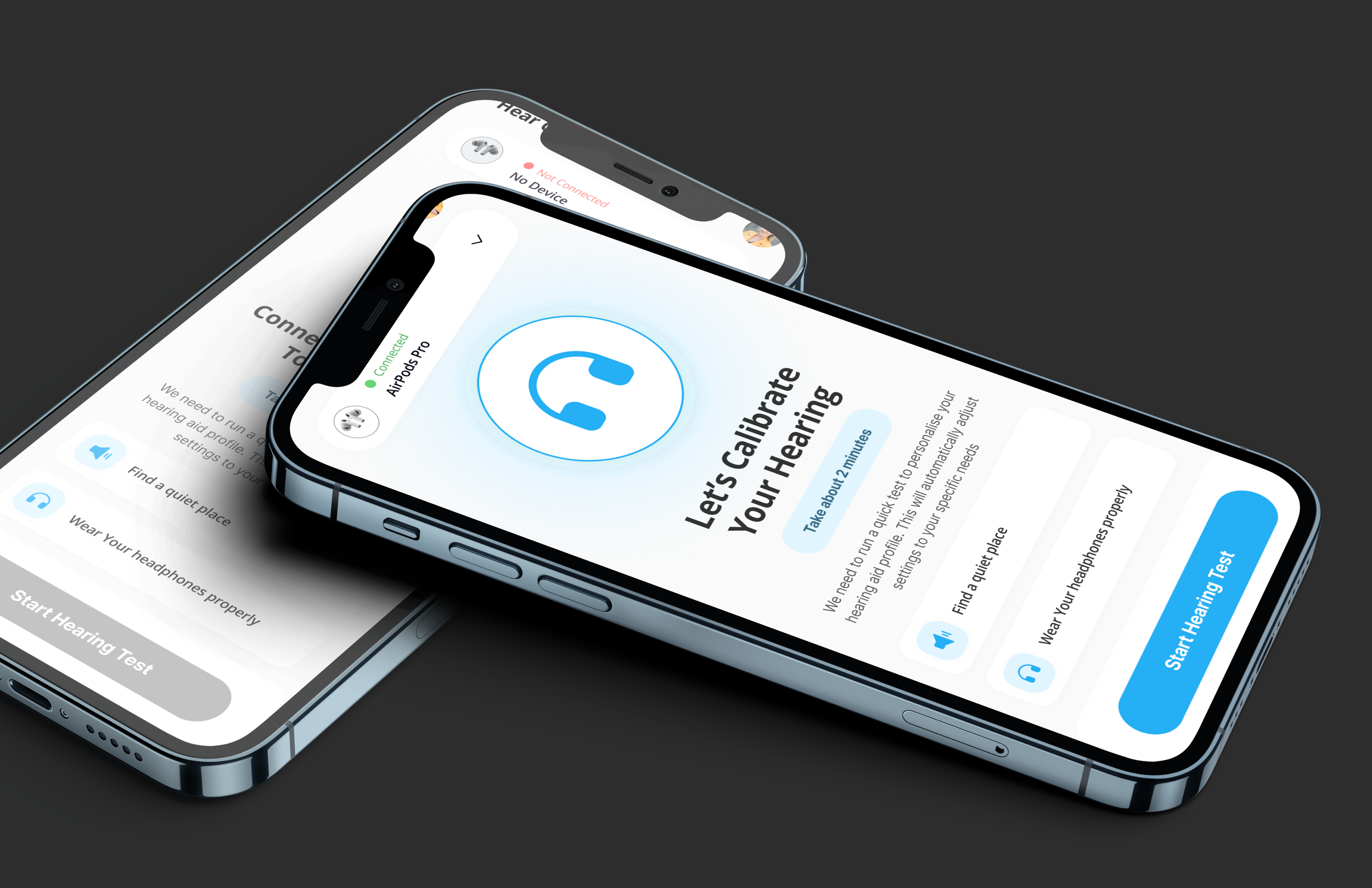
Created a single main screen with a large Amplify ON/OFF action
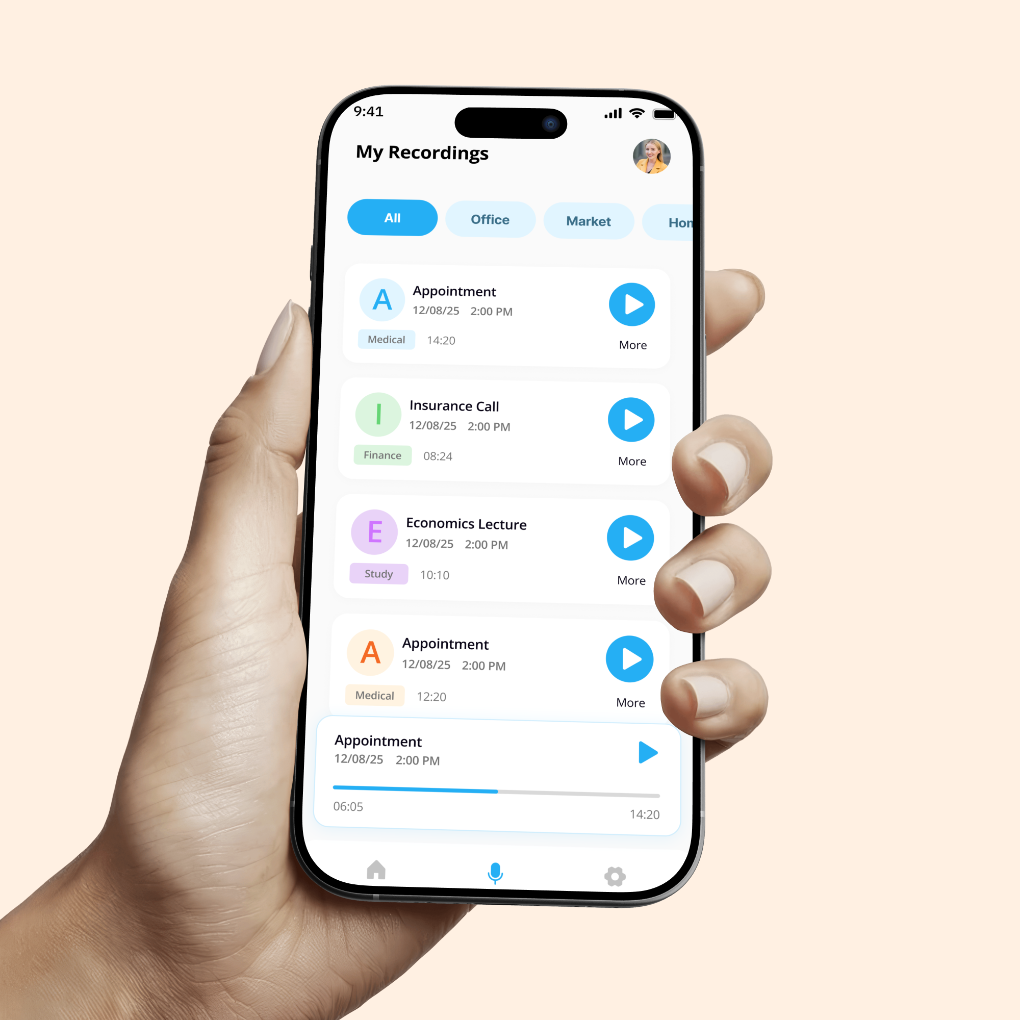
Introduced preset modes like Home, Outside, TV, and Meeting for quick use
Used large text, high contrast colors, and simple icons for accessibility
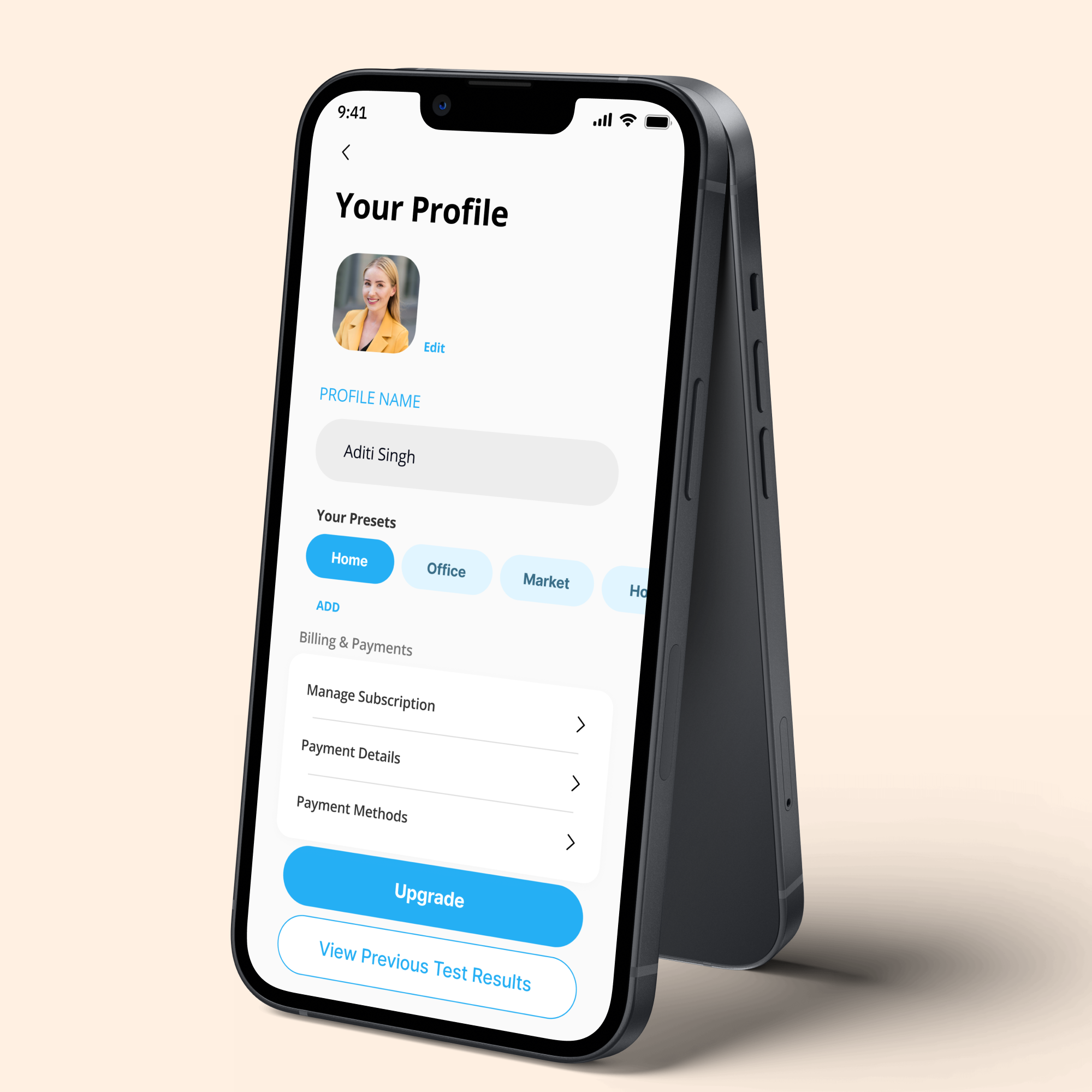
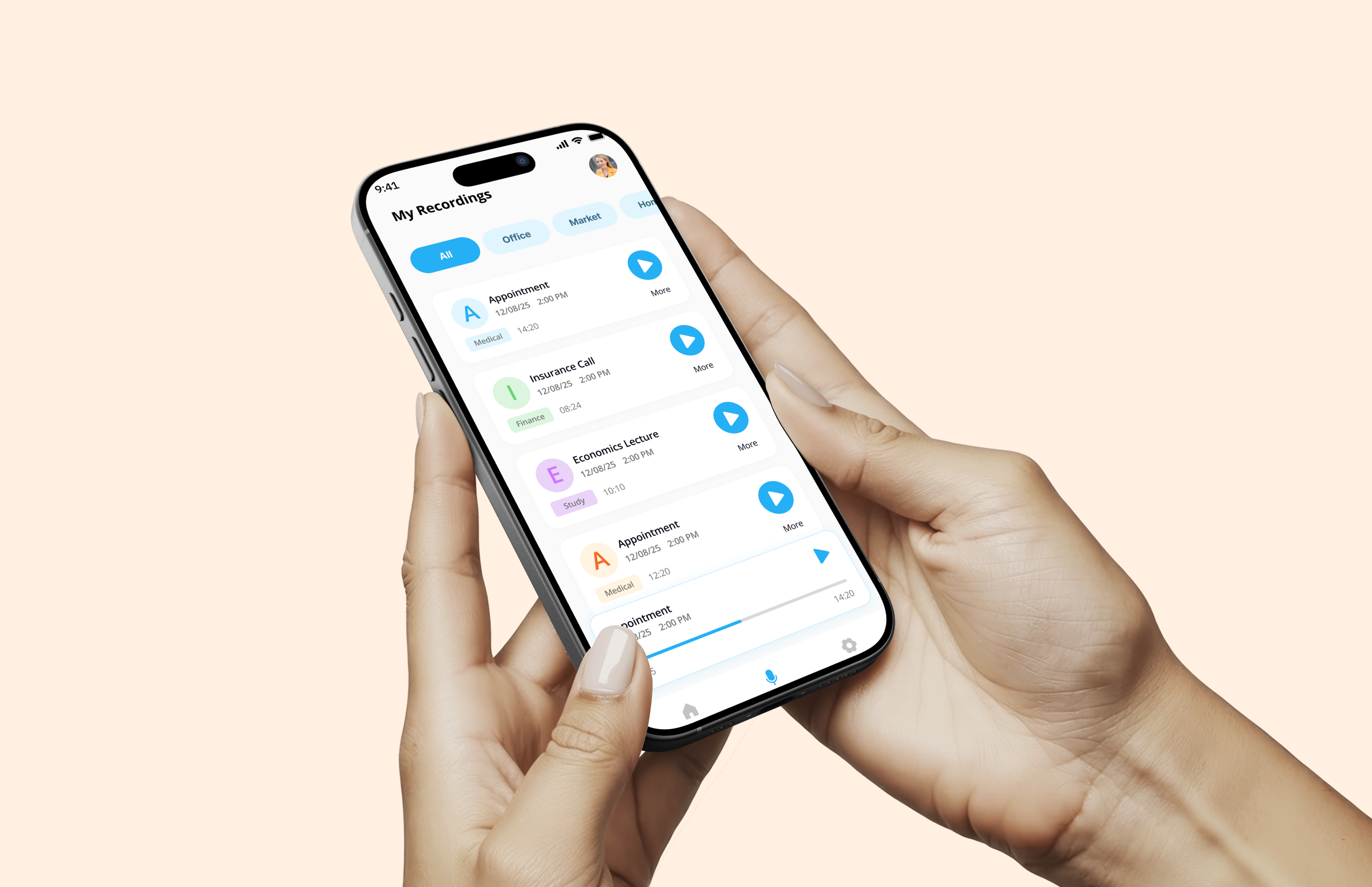
Reduced advanced settings and moved them to secondary screens
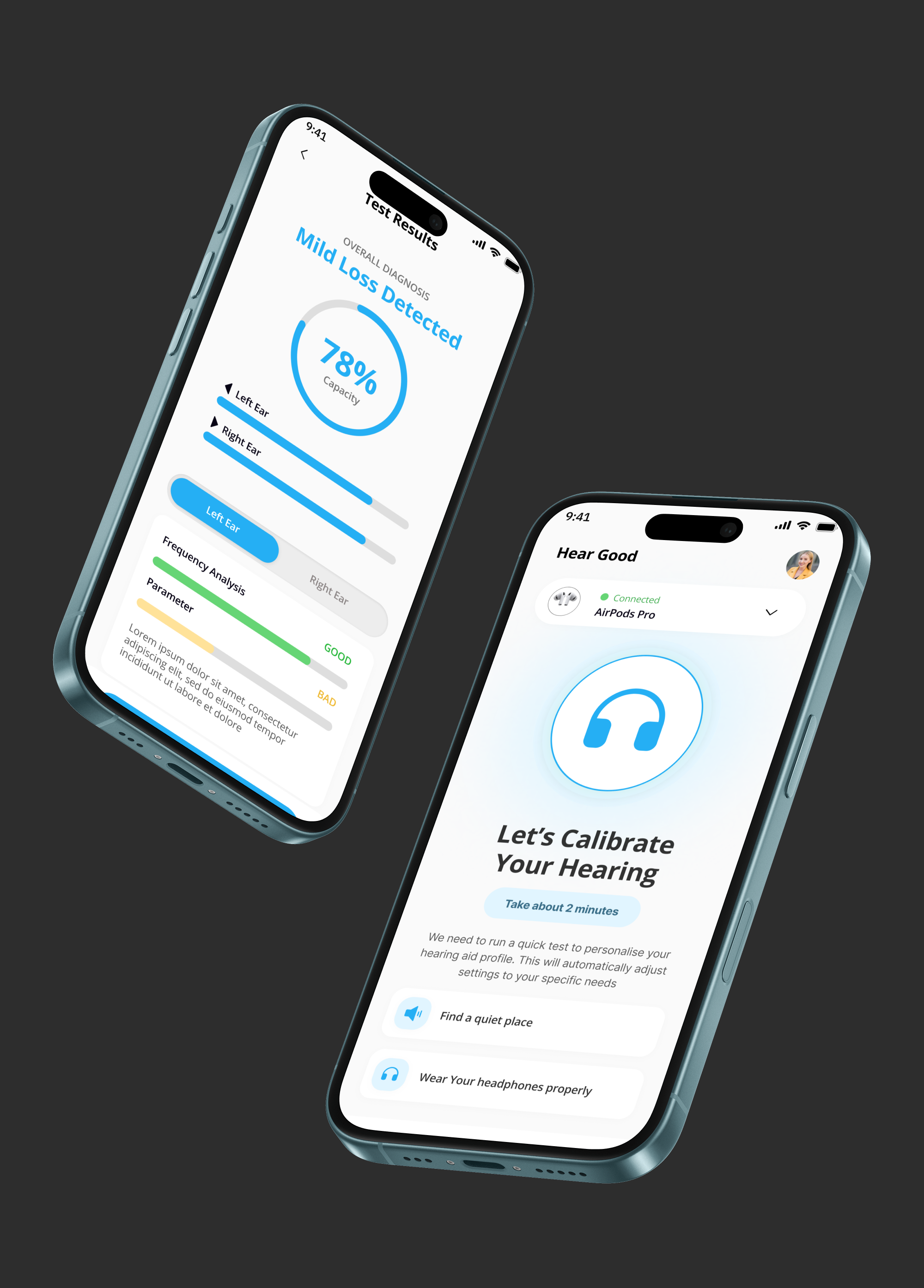
Added clear headphone status and safe volume indicators
Designed the flow to work with minimal taps and no technical language
Key Design Decision
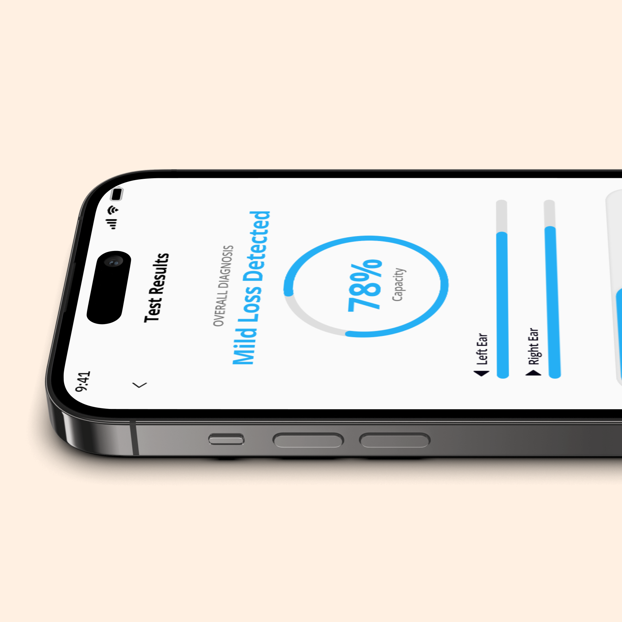
Outcome
The redesigned app delivers a calmer and more confident hearing experience. Users can start amplification instantly, switch sound modes easily, and understand what the app is doing at every step. The new structure reduces confusion, supports everyday hearing needs, and makes the app usable even for first-time or elderly users.
What This Project Shows
This project shows Pixel & People’s strength in designing accessible, research-led digital experiences for healthcare and assistive products with a strong focus on real human needs.